business intelligence
Beyond Market Intelligence keeps business intelligence in one place: 8 stories so far. The section currently leads with “Transform Excel Insights Into Polished PowerPoints With AI Assistance”, “Turn scattered referral data into one clear monthly view.”, and “Navigate Microsoft Fabric with confidence and purpose, not panic.”. Excel holds the answers, but PowerPoint is where decisions get made. Merging multiple tables that share an X axis but carry different Y axes is a familiar wall for anyone wrestling with monthly referral data. Acme AI is the next-generation, AI-powered spreadsheet platform built to replace Excel and redefine how analysts, data scientists, and enterprise teams work… The list below is every business intelligence story on Beyond Market Intelligence, newest first.
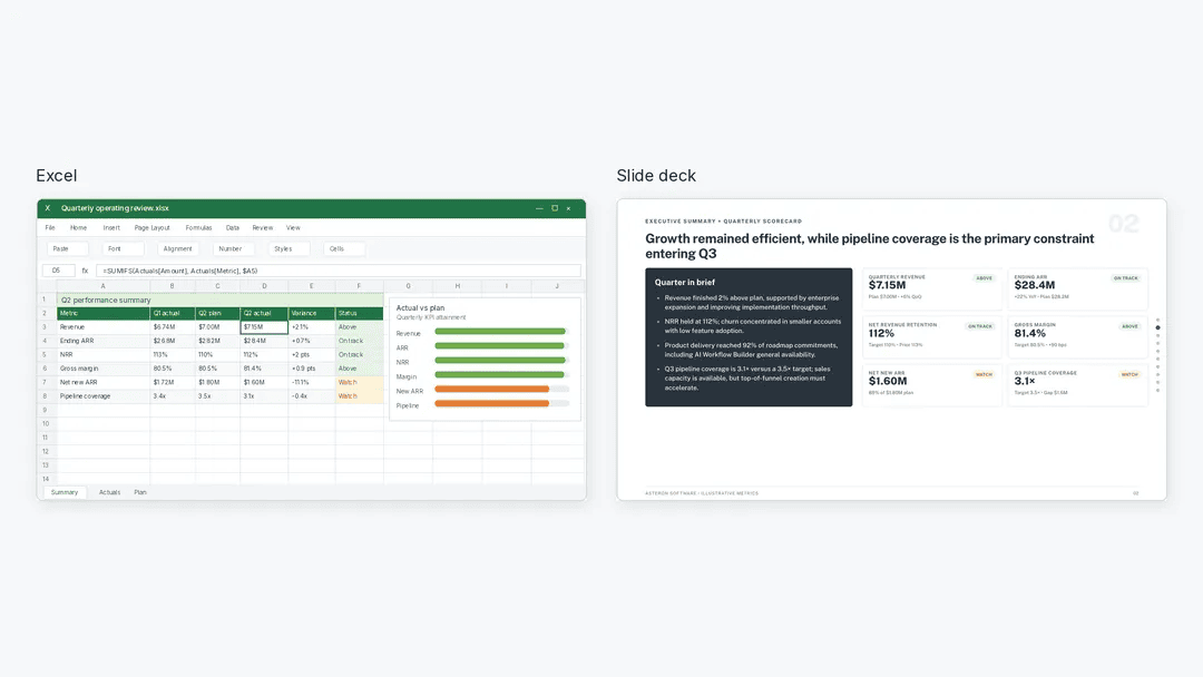
Transform Excel Insights Into Polished PowerPoints With AI Assistance
Excel holds the answers, but PowerPoint is where decisions get made. Julius AI bridges that gap, letting you analyze your data, verify the numbers, and generate an editable deck without the manual grunt work. It is a practical workflow for anyone tired of copy-pasting charts. For a deeper look at how to keep AI systems like this reliable, our guide on designing guardrails around agents pairs well with the ideas here.
Turn scattered referral data into one clear monthly view.
Merging multiple tables that share an X axis but carry different Y axes is a familiar wall for anyone wrestling with monthly referral data. The manual route works, but it's tedious and prone to error, especially when you're juggling several sources. What you're describing isn't just about efficiency; it's about reclaiming time for analysis over assembly. Tools like pivot tables or a simple script can handle this transformation cleanly. For those exploring broader data-shaping ideas, our piece on TanStack Charts touches on flexible visualization approaches.
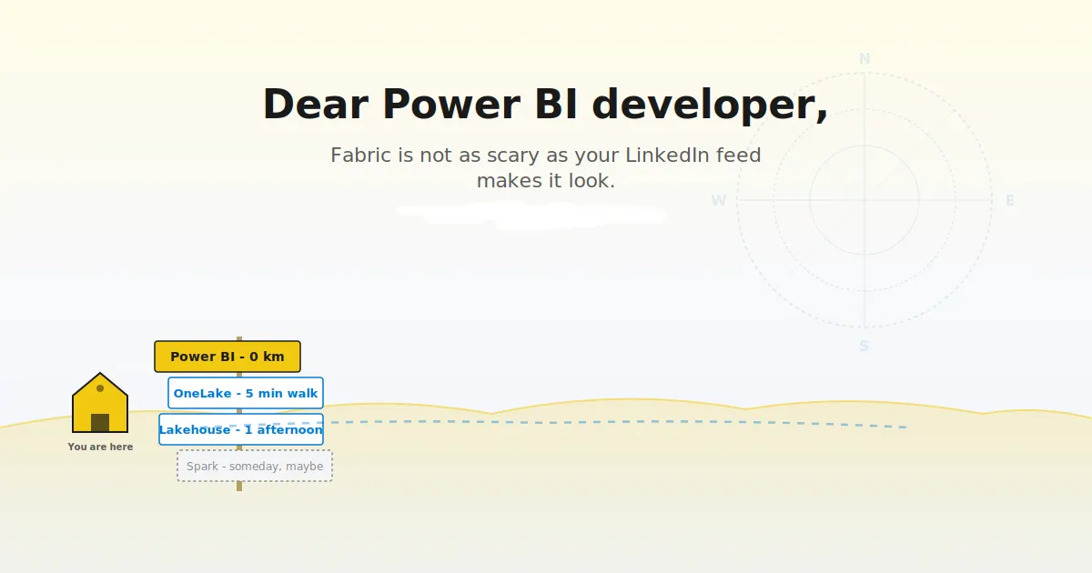
Navigate Microsoft Fabric with confidence and purpose, not panic.
Power BI Premium's retirement isn't a crisis; it's a handoff. For developers, Microsoft Fabric changes the ground rules, but not the core craft. This guide cuts through the noise, separating what truly shifts in your workflow from what stays comfortably familiar. It's a practical starting point for those who'd rather adapt with clarity than react with alarm. For a deeper look at how structured thinking applies elsewhere, explore our piece on how LLMs navigate token space. The takeaway?

Adobe expands its data intelligence reach with second Indian acquisition
Adobe's acquisition of Indian market intelligence startup Rilo signals more than a portfolio update, it's a deliberate bet on data agility. This marks the company's second purchase out of India, following Rephrase.ai in 2023, and it reinforces a clear pattern: smart, targeted innovation over flashy moves. For teams wrestling with static spreadsheets, this feels like a quiet nod toward tools that think ahead. We're watching closely, and we'll keep exploring how such shifts reshape everyday workflows.

Beyond Flat Tables A Practical Guide to Star Schema Dimensions
Dimensions often get treated as a single concept, but they come in distinct types, each serving a different analytical purpose. This guide breaks down those variations clearly, helping you choose the right structure for your data model. It's a practical read for anyone moving beyond basic spreadsheets and into more deliberate design. If you are curious about how structured thinking applies elsewhere, our piece on bridging retrieval and action offers a useful parallel.

Rippling launches a tool to track what teams actually spend on AI
Rippling spent millions on AI in months before realizing it had no idea where the money went. That wake-up call led to AI Spend Console, a tool that tracks individual and team AI spending. It's a practical response to an expensive blind spot. For anyone who has wondered whether their AI tools are worth the cost, this product offers clarity.

Palantir's billion-dollar quarter challenges AI's trust deficit
Palantir just posted $1 billion in profit, and Alex Karp responded by calling the AI industry "Marxist." That's a bold word from a CEO whose own success depends on the same frontier labs he's warning enterprises about. His point deserves attention: if these tools can't be trusted, why rush them into critical workflows? We're not here to defend big tech's habits, but we'd rather see scrutiny than blind adoption.

Explore how AI simplifies waterfall charts for clearer data storytelling
A waterfall chart only earns its keep when it tells a clear story about how values move. The key is sequencing: each bar must connect logically to the next, showing additions and subtractions without clutter. Start with a solid baseline and label every step, because ambiguity defeats the purpose. Red and green should mean something consistent, not just decorate the axis. If you want to sharpen your visual instincts further, our piece on TanStack Charts offers a fresh take on grammar-of-graphics thinking.