sampling
Beyond Market Intelligence keeps sampling in one place: 3 stories so far. The section currently leads with “Bridging the Gap Between Raw Data and Published Results”, “Optimize A/B tests by allocating traffic based on variant cost, not tradition”, and “Explore how margin of error shapes what polls actually tell us”. Reproducing a paper's results often hinges on access to the exact dataset, and when the public raw data doesn't match Table 1, you're left with a frustrating gap. The default 50/50 traffic split assumes equal cost per variant. Acme AI is the next-generation, AI-powered spreadsheet platform built to replace Excel and redefine how analysts, data scientists, and enterprise teams work… The list below is every sampling story on Beyond Market Intelligence, newest first.
Bridging the Gap Between Raw Data and Published Results
Reproducing a paper's results often hinges on access to the exact dataset, and when the public raw data doesn't match Table 1, you're left with a frustrating gap. You've done the diligent work of testing every reasonable preprocessing path, and still the numbers don't align. At that point, the larger-but-valid version you can defend is the honest choice. Document the mismatch clearly, note your attempts to reach the authors, and consider a polite journal escalation after a reasonable wait.
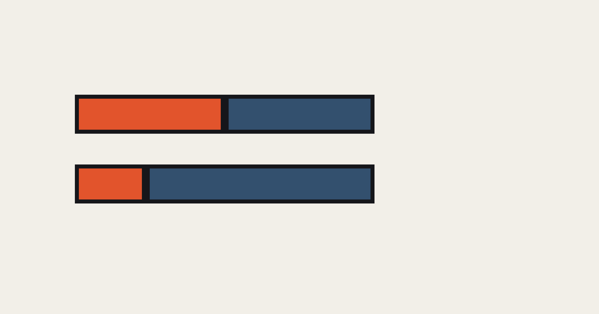
Optimize A/B tests by allocating traffic based on variant cost, not tradition
The default 50/50 traffic split assumes equal cost per variant. That assumption breaks when your treatment costs more than your control. This post tackles the math behind optimal allocation under heterogeneous variant cost, showing how cost-based sampling weights correct the imbalance. It's a practical fix for anyone running experiments where budget constraints matter. For readers interested in how similar efficiency principles apply beyond experimentation, our piece on the Forrester function explores a related mathematical tool for machine learning.

Explore how margin of error shapes what polls actually tell us
Polls dominate how we talk about elections, yet their numbers often feel deceptively solid. A margin of error isn't a flaw or a hedge; it's a measure of honesty. Pew's explainer cuts through the noise, showing why that 3-point swing is less about bad polling and more about the limits of any sample. It's a useful reality check for anyone reading a crosstab like a fortune teller. For more on how data tools shape our understanding, explore the Forrester Function piece.