visualization
Beyond Market Intelligence keeps visualization in one place: 20 stories so far. The section currently leads with “A fly brain races for 24/7 and you can watch the live stream”, “Which AI Assistant Handles Data Science Tasks Best for Statisticians”, and “Build a complete data science stack for free with these open-source AI tools”. A fly brain with roughly 2,400 neurons is now drag racing cars on a live Twitch stream. Statisticians evaluating ChatGPT, Claude, and Gemini for data science work need a clear, practical comparison, not marketing hype. Acme AI is the next-generation, AI-powered spreadsheet platform built to replace Excel and redefine how analysts, data scientists, and enterprise teams work… The list below is every visualization story on Beyond Market Intelligence, newest first.
A fly brain races for 24/7 and you can watch the live stream
A fly brain with roughly 2,400 neurons is now drag racing cars on a live Twitch stream. For four weeks, one developer has been training Drosophila brain models to control a simulator, turning the process into a racing league with generations, dynasties, and Elo ratings. The current dry-strip record sits at 10.06 seconds. It is a genuinely quirky experiment in embodied AI training.
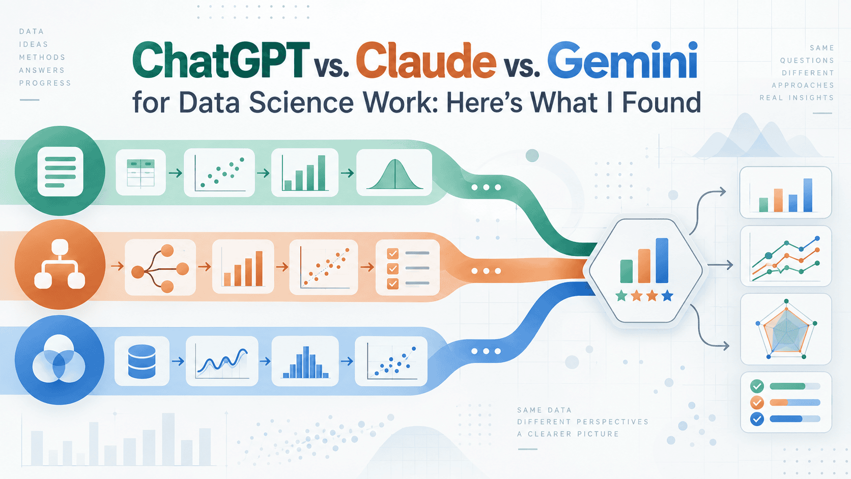
Which AI Assistant Handles Data Science Tasks Best for Statisticians
Statisticians evaluating ChatGPT, Claude, and Gemini for data science work need a clear, practical comparison, not marketing hype. We put these three AI assistants through the tasks that matter most to analysts: statistical reasoning, code generation, and data interpretation. The results reveal meaningful differences in accuracy and approach. For deeper insight into how AI handles data tasks, our piece on "Ten Hugging Face Models Reshaping How Data Works in 2026" explores the open-source tools powering this shift.
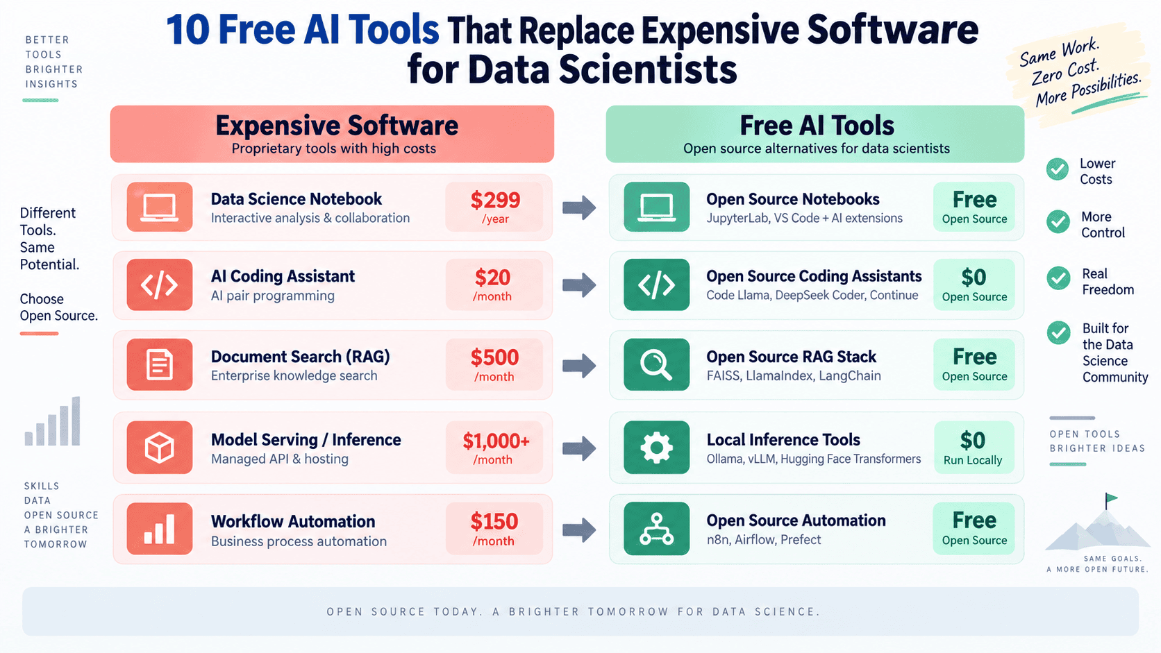
Build a complete data science stack for free with these open-source AI tools
Building a production-grade data science stack doesn't have to strain your budget. Open-source AI tools now match, and sometimes exceed, the capabilities of their paid counterparts, giving you a complete toolkit for free. This is about empowerment, not compromise. If you've been exploring how smarter workflows can transform your practice, our piece on semi-supervised learning as an underrated path offers a fitting next step.

Uncovering Hidden Structure: How Font Embeddings Bloom Into Visual Patterns
When Dylan Berndt fed thousands of Google Fonts through a custom neural network and compressed the resulting embeddings into color and position, something unexpected bloomed: a flower. The structure emerged organically, with cursive fonts clustering in the stamen. It's a striking reminder that pre-trained models can reveal visual relationships we didn't design them to find. For more on how data can uncover hidden patterns, explore how language models learn to copy context with hash tables.
Explore how to filter 5000 IDs outside your Power BI model
Filtering 5000 IDs that live outside your Power BI model doesn't have to be a headache. The trick is to bring that external list into your analysis without merging it into your dataset. A simple approach: load your IDs as a separate table, then use DAX or Power Query to cross-reference them against your model. It keeps your data clean and your slicers responsive. For more on navigating unexpected syntax shifts, our article on VLOOKUP changes might offer helpful context.
Visualizing Project Budgets: Tracking Spend and Completion Clearly
A stacked bar chart is a smart, intuitive solution for tracking project budgets against spend and completion. Each group becomes its own bar: show the budgeted amount as the total length, then stack actual spend and forecasted remaining costs inside. This instantly reveals which groups are overspent, underspent, or complete. For deeper data-visualization techniques, our article "Visualize Neural Network Training Directly in Your Browser" explores similar clarity in complex tracking.
Visualize Neural Network Training Directly in Your Browser
Watching neural networks train often feels like staring at a black box, but OpenTrainDNN changes that by putting the process directly in your browser. This open-source, client-side app visualizes backpropagation, activation flows, and weight updates in real-time, no servers or special hardware required. It's a practical way to see the mechanics behind deep learning, not just theorize about them. For those wanting to dig deeper into model behavior, our related piece on real-world computer vision deployments offers a useful companion perspective.

Explore the Inner Workings of sanoTTS: A Deep Dive into AI Synthesis
Every tensor on the sanoTTS anatomy page is real, pulled from the shipped int8 model as it synthesized an actual sentence. No stand-ins. That authenticity turns a technical breakdown into something you can trust and explore. This is vibe coding at its best, using interactive visuals to make the core mechanics of AI synthesis click. If you are curious about how these models truly operate, this is a refreshingly honest look.

Visualize Neural Network Training: A Step-by-Step Interactive Tool
Watching weights adjust in real time is the difference between memorizing backprop and actually feeling it. OpenTrainDNN strips away setup friction, letting anyone tweak learning rates or network depth and see convergence or collapse happen live. That's the kind of hands-on clarity theoretical guides often miss. For a tool built to demystify training mechanics, it hits a practical sweet spot. If you're curious about broader model deployment challenges, our related piece on real-world computer vision offers a useful follow-up.

Turn inspiration into action with AI that redesigns your own room.
Pinterest is testing Restyle, a new AI-powered feature that lets you visualize furniture, decor, and lighting directly in photos of your own rooms. It's a practical step toward turning saved inspiration into actual purchases, and we think that's a smart move. Rather than just pinning ideas into a void, you can see how they might fit your space. For more on how AI tools are reshaping everyday tasks, check out our piece on verifying your AI's understanding this tax season.

Explore how JupyterGIS transforms collaborative mapping and data visualization.
JupyterGIS 0.16 isn't just another incremental update. It's a deliberate step toward making geographic data work the way modern teams do: together, in real time, without the usual friction. The new declarative symbology and collaborative workflows put powerful visualization directly in the notebook, while expanded support for large-scale remote sensing and R users broadens its reach. Community feedback rightly pushes for better portability, and that's the kind of practical challenge worth solving.

Visualizing Telemetry Data Beyond the Default Line Chart
Line charts have served observability well, but they were never designed to answer every question a modern systems engineer needs to ask. In her presentation, Yao Yue draws on 15 years of operating large-scale systems to challenge this default. She shows how moving beyond time-series basics can directly address critical capacity and fleet-sizing decisions. It is a practical, overdue call to rethink how we visualize telemetry. For those exploring how AI reshapes data work, our piece on Jev versus LLMs offers a useful companion.
Keep your plot anchored while your spreadsheet grows daily.
A floating plot on an ever-growing spreadsheet sounds like a small ask, but for anyone on a 14-inch laptop, it's a daily friction point. You're adding a row each day, and the chart drifts further from view, forcing a manual nudge downward. It's a reasonable frustration. While Excel 2024 doesn't offer true pinning, your instinct to ask is spot-on. Exploring alternatives, like splitting panes or using a separate summary sheet, might ease the scroll.
Run Your Data Analysis Where Your Data Lives
Most dataframe work pulls data out of the database, then pushes it back after Python finishes its part. memFrame flips that script. It compiles your Python/DataFrame API calls directly into SQL, letting DuckDB, PostgreSQL, or ClickHouse do the heavy lifting where the data lives. That is a smarter default. The incremental release strategy is also a good discipline: get inspection, cleaning, and arithmetic solid before tackling groupby and window functions. For deeper Python performance thinking, our guide on advanced techniques pairs well here.
Transform your survey data into clear before and after charts with AI
Struggling to line up headers and values for a before-and-after chart is a familiar snag, especially when the goal is a clean, stacked visual. The trick often lies in how you structure the source data, not the chart type itself. Reshape your questionnaire results into a simple table with categories as rows and time points as columns, then let Excel handle the rest. It's a small step that turns a frustrating task into something intuitive.

Exploring how one small edit can unravel a chess AI's deepest strategy
One head. Out of 128. Remove it, and a chess transformer stops seeing Morphy's legendary queen sacrifice entirely. That's the kind of surgical fragility worth pausing over, not because it breaks the model, but because it reveals how much meaning concentrates in a single parameter. The Chessformer Lens demo makes that visible, and the GitHub notebooks let you verify it yourself. For anyone curious about interpretability, this is a hands-on invitation to explore.

From Static Charts to Interactive Discovery with AI-Driven Tools
Choosing between Matplotlib and Plotly often comes down to a single question: do you need a static image or a living document? This guide walks that decision without overselling either tool, which is refreshing. It respects that your choice depends on the task at hand, not hype. If you are curious about how structured thinking applies to other technical domains, our piece on paragraph structure and token space offers a thoughtful parallel worth exploring. For now, this guide gives you a clear, practical path forward.

Explore a Concrete 3D Path Through the Jacobian Conjecture
The Jacobian Conjecture sounds abstract, but this piece grounds it in something we can actually see. The author takes a dense mathematical statement and reframes it through a concrete 3D function, using geometry and algebra to make the counterexample click. It's a smart, approachable way to engage with a complex idea. If you enjoy this kind of clarity, you might also appreciate our look at the Forrester function as a machine learning tool. Both offer fresh angles on mathematical thinking.

Explore how AI sees Trump before context enters the picture
A single word, "Trump," behaves like two different neighbors depending on how you slice its embedding. In GPT-2 Small's static table, discretizing the coordinates surfaces generic political names like Mitt and Pelosi. Keep the continuous values, and the same token clusters with family, staff, and rivals like Obama and Eisenhower. That gap is a quiet reminder that representation choices shape what models see.
Explore how GPT-2 maps tokens with an interactive visual graph.
There's a quiet thrill in tapping a single token and watching its nearest kin appear. This interactive map of GPT-2's token embedding space makes that possible, offering 32,070 alphabetic tokens to explore with a pinch or a tap. No forward pass, no context, just raw relationships laid bare. The t-SNE layout and minimum spanning tree ensure every line represents a genuine neighbourly bond. It's a hands-on way to grasp how the model organises language, and it works beautifully on mobile.