3 Visual Proofs of the Central Limit Theorem to Build Your Intuition
Our take
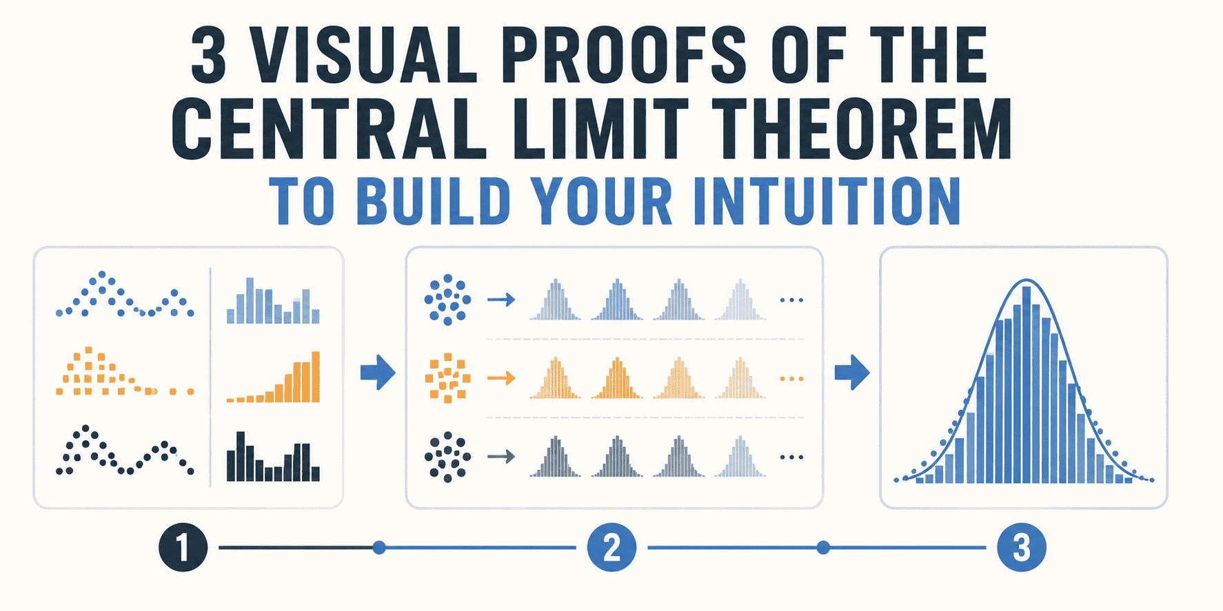
The ubiquity of the bell curve, or normal distribution, is a fascinating and often underappreciated aspect of statistics. The article "3 Visual Proofs of the Central Limit Theorem to Build Your Intuition" highlights this beautifully, demonstrating why understanding this concept is foundational for anyone working with data. It's a welcome reminder that while complex algorithms and machine learning models dominate much of the current conversation around data science, a solid grasp of statistical fundamentals remains crucial. Indeed, many of the challenges faced by data science graduates – as noted in [What Do Today’s Data Science Graduates Commonly Lack?] – stem from a lack of robust grounding in these core principles. The visual proofs offered in the article provide a compelling and accessible way to reinforce that understanding, moving beyond rote memorization of formulas to a more intuitive grasp of how the normal distribution arises naturally in many situations. For those transitioning from academia to industry, as explored in [Public health academia to industry], a strong statistical foundation is equally important; the ability to critically evaluate data and interpret results is a transferable skill highly valued across sectors.
The Central Limit Theorem (CLT) itself is deceptively simple: the distribution of sample means will approach a normal distribution, regardless of the original distribution, as the sample size increases. But the implications are profound. It allows us to make inferences about populations even when we don't know the underlying distribution of the population itself. This is a cornerstone of hypothesis testing and confidence intervals, vital tools for data-driven decision-making. The article’s focus on visual proofs is particularly effective because it bypasses the mathematical complexities that can intimidate newcomers. Instead, it offers a series of relatable examples that demonstrate how the bell curve emerges organically from seemingly disparate processes. This approach is particularly valuable in a field where many are seeking a more practical and less theoretical understanding of statistical concepts. Considering the range of choices for advanced study, such as the debate between an [MS in Operations Research vs Data Science], a deeper understanding of foundational concepts like the CLT can inform a more strategic educational path.
The broader significance of this understanding extends far beyond the realm of data science. The normal distribution appears in countless natural phenomena, from the distribution of heights in a population to the errors in scientific measurements. Recognizing its prevalence allows us to better model and interpret the world around us. Furthermore, a solid understanding of the CLT informs how we approach data analysis, encouraging a more critical and nuanced perspective. It reminds us that even with large datasets, statistical significance doesn't necessarily equate to practical significance, and that the assumptions underlying our analyses must be carefully considered. Dismissing the CLT in favor of more sophisticated techniques can lead to flawed conclusions and misguided decisions. This foundational understanding underscores the importance of continuous learning and a willingness to revisit the basics, even as the field of data science continues to evolve at a rapid pace.
Looking ahead, it’s increasingly clear that data literacy will become an essential skill across all industries. While advanced analytics and AI will continue to drive innovation, the ability to interpret and critically evaluate data – rooted in a solid understanding of statistical principles like the Central Limit Theorem – will be the key to unlocking its true potential. The question becomes: how can we best equip individuals with this essential knowledge, ensuring that the next generation of data professionals possesses not just technical skills, but also a deep and intuitive understanding of the fundamental building blocks of data science?
Read on the original site
Open the publisher's page for the full experience