7 Steps to Mastering Time Series Analysis with Python
Our take
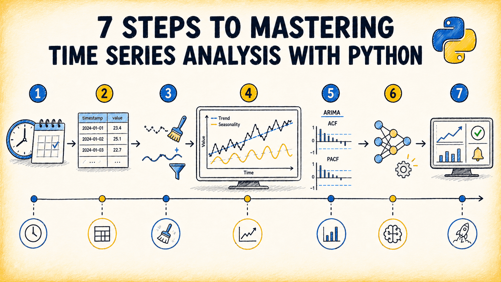
The recent guide titled “7 Steps to Mastering Time Series Analysis with Python” arrives at a pivotal moment for data professionals who rely on spreadsheets for day‑to‑day analysis. The article distills a complex workflow into seven actionable stages—from data ingestion and preprocessing to model selection and validation—making it a practical roadmap for teams that need to move beyond manual pivot tables and static charts. In the same breath, the piece echoes themes we’ve explored in earlier posts such as What the Agentic Era Means for Data Science and 3 SpaCy Tricks for Efficient Text Processing & Entity Recognition. These linked resources underscore a broader narrative: the shift from legacy spreadsheet workbooks to AI‑enhanced, code‑driven data pipelines that deliver both speed and precision.
Why does mastering time series with Python matter? Traditional spreadsheet tools excel at summarizing static snapshots, but they falter when patterns evolve over time. Forecasting demand, detecting seasonality, or identifying anomalies requires iterative modeling—a process that is tedious and error‑prone in a cell‑centric environment. By embracing Python’s ecosystem—pandas for tidy data, statsmodels for classic ARIMA frameworks, and newer libraries like Prophet or PyMC for probabilistic forecasting—analysts unlock the ability to automate repetitive tasks, version control every change, and scale analyses across thousands of series with a single script. This transition is not merely a technical upgrade; it transforms the analyst’s role from a spreadsheet wizard to a data steward who can focus on insight rather than data wrangling.
The article’s step‑by‑step structure also demystifies the often intimidating world of statistical modeling. For instance, the first step emphasizes data quality: cleaning missing values, aligning time stamps, and ensuring stationarity. These are foundational practices that, when neglected, can lead to misleading forecasts. The subsequent steps introduce decomposition, model selection, and hyperparameter tuning, each presented with code snippets that readers can copy, paste, and adapt. By providing concrete examples, the guide lowers the barrier to entry for users who may have previously dismissed Python as too complex. Moreover, the emphasis on validation—using walk‑forward splits and error metrics like MAPE and RMSE—encourages a disciplined, reproducible workflow that aligns with the principles discussed in our calibration deep dive, where model confidence must be continuously checked and adjusted.
From a strategic perspective, this shift dovetails with the agentic era of data science, where autonomous agents can suggest models, preprocess data, and even generate exploratory reports. By mastering the fundamentals outlined in the article, teams position themselves to leverage these emerging tools effectively. The skill set required today is not just coding; it is the ability to interpret model outputs, communicate uncertainty, and translate predictions into actionable business decisions. The guide’s focus on actionable insights—such as interpreting seasonality plots or understanding the impact of lag terms—ensures that users can translate technical results into stakeholder‑friendly narratives.
Looking ahead, the integration of AI-native spreadsheet technology promises to bridge the gap between spreadsheet familiarity and code flexibility. Imagine a future where a single click in a spreadsheet cell triggers a Python backend that cleans, models, and visualizes time series data, returning results in the same familiar grid. This convergence would democratize advanced analytics, allowing non‑technical users to benefit from sophisticated forecasting while maintaining the intuitive interface they trust. The article’s practical roadmap is therefore a stepping stone toward that vision, equipping readers with the know‑how to build the first iterations of such hybrid workflows.
As we close, the question that deserves our attention is: how will organizations balance the need for rapid, spreadsheet‑like interactivity with the rigor of code‑based modeling? The answer may lie in modular architectures that let users choose the level of abstraction that best fits their task—whether it’s a quick spreadsheet snapshot or a fully automated forecasting pipeline. The time series guide is a clear sign that the future favors those who can navigate both worlds with confidence and purpose.
Read on the original site
Open the publisher's page for the full experience