data visualization
18 stories filed under data visualization on Beyond Market Intelligence. The newest of them: “When Data Tells Two Truths, the Paradox Reveals the Insight”, “Open-Sourcing FlexViz for Instant Exploration of Billion-Point Datasets”, and “Mapping Japan's Data: When Excel Can't Find the City”. Both charts are right, yet they disagree. FlexViz turns a billion-point dataset into a chart you can explore in a quarter of a second. Acme AI is the next-generation, AI-powered spreadsheet platform built to replace Excel and redefine how analysts, data scientists, and enterprise teams work… The list below is every data visualization story on Beyond Market Intelligence, newest first.
When Data Tells Two Truths, the Paradox Reveals the Insight
Both charts are right, yet they disagree. That's the paradox at the heart of this story, and it's exactly where real insight hides. When you combine data, the narrative can flip, not because the numbers are wrong, but because context changes everything. This isn't a flaw; it's a signal. Understanding why two truths conflict reveals more than either truth alone. For a deeper look at how assumptions shape results, see our related piece on participant-aware evaluation in EEG models.

Open-Sourcing FlexViz for Instant Exploration of Billion-Point Datasets
FlexViz turns a billion-point dataset into a chart you can explore in a quarter of a second. That speed comes from lessons learned building plotly-resampler, which racked up over 18 million installs. But the real shift is agent-native design. Everything is a spec, so an AI can create, follow, and update visualizations without screenshots. The interactive view becomes the conversation. For anyone juggling larger-than-RAM data, this is a practical step toward workflows that feel natural for both humans and machines.
Mapping Japan's Data: When Excel Can't Find the City
Excel's Map Chart handles U.S. counties without a hitch, but Japanese municipalities? That's a different story. One user found that cities like Aisai work fine, while Handa and Kariya appear in the legend yet remain uncolored, and Ōguchi‑chō is simply "not found." This isn't user error; it's a Japan‑specific limitation in Bing Maps polygons. If you're feeling constrained by traditional tools, it's time to explore alternatives.

Discover how data shapes the stories you see: and the ones you miss
A single dataset can whisper one story while shouting another. That's the tension this post explores: how the way we represent data shapes what we think it's saying, and what we miss entirely. It's a thoughtful reminder that spreadsheets aren't neutral. They frame our view. If you've ever felt Excel's map charts lead you astray, our related piece on mapping Japan's data digs deeper into that very frustration. Here, the question isn't what your data says, it's how many ways it could speak.
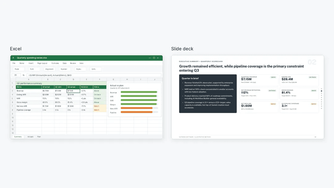
Transform Excel Insights Into Polished PowerPoints With AI Assistance
Excel holds the answers, but PowerPoint is where decisions get made. Julius AI bridges that gap, letting you analyze your data, verify the numbers, and generate an editable deck without the manual grunt work. It is a practical workflow for anyone tired of copy-pasting charts. For a deeper look at how to keep AI systems like this reliable, our guide on designing guardrails around agents pairs well with the ideas here.
Explore a complete ML learning journey from NumPy to Transformers.
Five months of daily commits is a serious signal. This isn't a weekend project; it's a disciplined path from NumPy fundamentals all the way to Transformers. For anyone feeling overwhelmed by the machine learning landscape, this public repo offers a practical antidote. It covers the essential ground: classical models, deep learning, and the data handling in between. It's a resource built by someone who did the work, and it's open for you to explore.
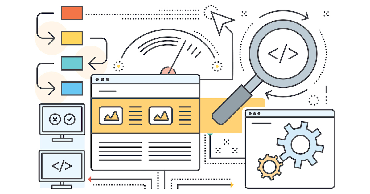
Explore how TanStack Charts lets you compose visualizations, not just pick chart types.
TanStack Charts enters the alpha stage with a clear promise: stop forcing data into fixed chart types and start composing the visuals your project actually needs. This framework-agnostic library for TypeScript, now pulling around 160,000 weekly downloads, speaks to a developer base eager for flexibility. It is not yet production-stable, so treat it as a tool for exploration rather than a drop-in dependency.
Turn scattered referral data into one clear monthly view.
Merging multiple tables that share an X axis but carry different Y axes is a familiar wall for anyone wrestling with monthly referral data. The manual route works, but it's tedious and prone to error, especially when you're juggling several sources. What you're describing isn't just about efficiency; it's about reclaiming time for analysis over assembly. Tools like pivot tables or a simple script can handle this transformation cleanly. For those exploring broader data-shaping ideas, our piece on TanStack Charts touches on flexible visualization approaches.

Visualizing Telemetry Data Beyond the Default Line Chart
Line charts have served observability well, but they were never designed to answer every question a modern systems engineer needs to ask. In her presentation, Yao Yue draws on 15 years of operating large-scale systems to challenge this default. She shows how moving beyond time-series basics can directly address critical capacity and fleet-sizing decisions. It is a practical, overdue call to rethink how we visualize telemetry. For those exploring how AI reshapes data work, our piece on Jev versus LLMs offers a useful companion.

Mapping the Underground: A New Era for Utility Work Begins.
A $26 million Series A is a strong signal that the industry is ready to move past outdated workflows. This startup isn't just building software; it's targeting the friction head-on, aiming to cut through the red tape that slows utility and construction projects. That focus on practical, human-centered outcomes is what makes this funding round feel different. For more on how digital infrastructure is reshaping traditional sectors, you might find our piece on Cloudflare's EmDash migration relevant. We're watching this space closely.

Where Data Meets Design to Make Decisions That Stick
Most dashboards look beautiful and still fail the only test that matters: do they change what someone does next? Meriem Benhabiles argues that data visualisation only works when structured UX thinking shapes it, from the questions asked before opening a tool to the choices that help an insight land. That is a refreshingly practical stance. It pairs well with our coverage of how AI voice transparency and clean data practices shape user trust, so exploring those pieces deepens the picture.
Find your font voice to make every spreadsheet more intuitive and productive.
Fonts are a quiet obsession, and the thread asking "What font is everyone using?" taps into something real. We all have go-tos, whether it's Inter for clean dashboards or a serif like Source Serif for long-form reads. The why matters more than the name. Different use cases demand different voices, and your font should match the task. For a deeper dive into how design choices shape user experience, check out our piece on preparing apps for flexible displays. Pick a default that empowers, then adapt.

Explore PostgreSQL Internals Through an Interactive 3D City Simulation
PostgreSQL's internals don't have to stay locked behind documentation. PGSimCity, an open-source project by Nikolay Samokhvalov, turns them into a 3D spatial simulation you can explore right in your browser. It's a practical way for backend developers and site reliability engineers to grasp SQL behavior and kernel execution dynamics through interactive play. The project is live on GitHub, inviting hands-on learning. For those already thinking about distributed systems, our guide to distributed training algorithms pairs naturally with this visual approach.
Transform your survey data into clear before and after charts with AI
Struggling to line up headers and values for a before-and-after chart is a familiar snag, especially when the goal is a clean, stacked visual. The trick often lies in how you structure the source data, not the chart type itself. Reshape your questionnaire results into a simple table with categories as rows and time points as columns, then let Excel handle the rest. It's a small step that turns a frustrating task into something intuitive.

How AI Transformed a Data Scientist's Daily Workflow
The morning no longer starts with a chaotic scramble through CSV files. By 2026, the data scientist's workflow has shifted from manual cleanup to strategic oversight, where AI handles the repetitive grind. It's a transformation that feels less like automation and more like partnership. We still ask the hard questions, but now we have a thinking partner that accelerates discovery.

From Static Charts to Interactive Discovery with AI-Driven Tools
Choosing between Matplotlib and Plotly often comes down to a single question: do you need a static image or a living document? This guide walks that decision without overselling either tool, which is refreshing. It respects that your choice depends on the task at hand, not hype. If you are curious about how structured thinking applies to other technical domains, our piece on paragraph structure and token space offers a thoughtful parallel worth exploring. For now, this guide gives you a clear, practical path forward.

Explore how AI simplifies waterfall charts for clearer data storytelling
A waterfall chart only earns its keep when it tells a clear story about how values move. The key is sequencing: each bar must connect logically to the next, showing additions and subtractions without clutter. Start with a solid baseline and label every step, because ambiguity defeats the purpose. Red and green should mean something consistent, not just decorate the axis. If you want to sharpen your visual instincts further, our piece on TanStack Charts offers a fresh take on grammar-of-graphics thinking.

Explore GPT-2's vocabulary through a flyable hyperbolic tree of 32,070 tokens
Somewhere in the internet's endless sprawl, a reddit user got tired of flat maps. So they built a better one. This isn't another 2D projection of GPT-2's vocabulary. It's a hyperbolic tree, housing all 32,070 tokens inside a Poincaré ball you can actually fly through. The layout is constructed exactly, with no optimisation or training involved. Trees don't fit well in flat space, but they embed naturally here. Drag, pinch, and tap to explore.