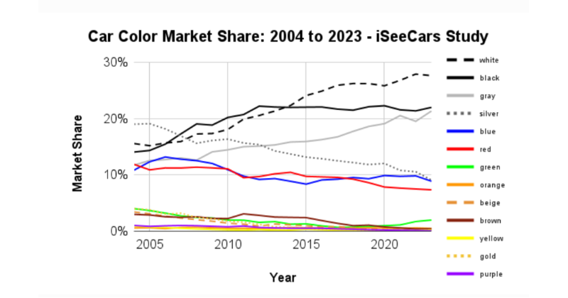
Last year, a study found that cars are steadily getting less colourful. In the US, around 80% of cars are now black, white, gray, or silver, up from 60% in 2004. The modern web is following the same path, and it's just as unnecessary. From A/B tests to AI slop, the digital landscape is being drained of its depth and originality. Standardized templates and relentless optimization have turned once-vibrant online spaces into a digital Levittown, uniform, predictable, and forgettable. This is not a natural evolution. It is a choice, and it can be unmade.
For users, this matters in practical ways. When every site follows the same layout, the same font stacks, and the same safe color palettes, the web stops feeling like a medium for expression. It becomes a utility. You visit a page, extract the information, and leave. There is no reason to linger, explore, or connect. The cost savings and consumer preferences that drove car colours toward monotony are mirrored in web design: safer choices, faster load times, higher conversion rates. But the trade-off is real. We lose the serendipity of stumbling onto something unexpected. We lose the personality that made early web communities feel alive. And we lose trust, because a web that looks identical everywhere starts to feel like it's run by the same invisible hand.
Restoring depth and originality doesn't require a return to chaotic design or broken layouts. It requires intentionality. Small acts of colour, typography, or even a single offbeat illustration can signal that a site was built by people, not assembled by a template. For creators and businesses, this is an opportunity to stand out simply by being human. In a world of sameness, originality becomes the most efficient differentiator. The data on car colours tells us that people accept monotony when it's the default. But defaults can be changed. The web was built to be a canvas, not a spreadsheet.
The solution is not a grand manifesto. It is a series of small, deliberate choices. Choose a colour that isn't safe. Write a headline that isn't optimized. Let a page breathe in a way that doesn't match the grid. The modern web will not restore its own colour. That work belongs to the people who build it, one pixel at a time.