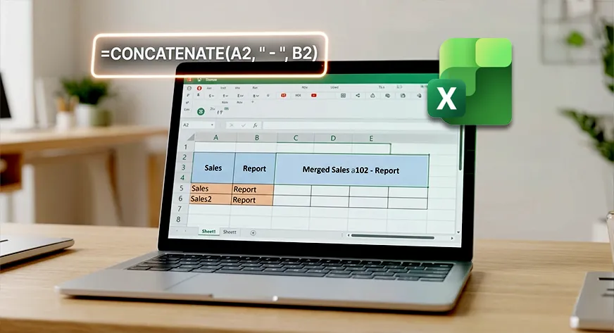
Merge is useful, but it is not the future of how data should work. The distinction between merging cells and truly combining data is one that every spreadsheet user should understand, because the choice affects everything from formatting to analysis. Walking through the mechanics of Merge in Excel does a service, but it stops short of what we believe matters most: the way you structure data determines what you can do with it later.
When you merge cells in a traditional spreadsheet, you are essentially destroying data structure for the sake of visual appeal. That centered title across multiple columns looks clean, but it creates a problem for sorting, filtering, and any automated process that expects a consistent grid. The Merge function is a workaround born from a tool that was never designed for dynamic, AI-native workflows. Combine, on the other hand, preserves the underlying rows and columns while giving you the visual result you want. It is a subtle shift in thinking, from arranging data for human eyes only to arranging data for both human understanding and machine processing. For anyone who has ever tried to export a merged spreadsheet into a database or a visualization tool, the frustration is immediate and familiar.
This is where the practical insight lies. Users familiar with Excel's basic functions can benefit from asking a simple question before merging: Will this data need to be analyzed later? If the answer is yes, then a combine approach, using formulas or dedicated functions that keep data intact, saves hours of rework. Merge is correctly identified as essential for presentation, but we would add that the smarter workflow is to separate presentation from structure. Use conditional formatting, custom number formats, or dedicated combine functions to achieve the same visual outcome without sacrificing data integrity. The tools exist; the habit simply needs to shift.
What this means for you is a more resilient spreadsheet. When you stop merging cells out of habit, you stop creating hidden problems. Your data remains sortable, filterable, and ready for the next step, whether that step is a pivot table, a chart, or an AI-powered analysis that expects clean columns. The tutorial is a good starting point, but the real takeaway is a principle: structure your data for flexibility first, then format for presentation. That principle is what separates a spreadsheet that works today from one that still works next month.