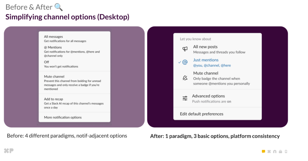
Slack's notification redesign is the rare example of a company fixing the right problem in the right way. Instead of layering more controls onto an already tangled system, the team stepped back and asked what users actually needed: clarity about what triggers an alert and how that alert reaches them. By separating activity from delivery, Slack made a structural change that respects the user's mental model. That's not a cosmetic tweak. That's a fundamental improvement, and the fivefold jump in settings engagement shows that when you make something easier to understand, people will actually use it.
For the average user, this means the end of the dreaded notification rabbit hole. Previously, adjusting alerts often felt like navigating a maze where one toggle led to another, and the relationship between channels, mentions, and keywords was murky at best. Now, the unified architecture removes that guesswork. You decide what deserves your attention, and then you decide how you want to be pinged. Those are two separate questions, and treating them as one was the root of the confusion. The fact that legacy settings were preserved through transformation rather than discarded outright is also a smart move. It acknowledges that change is hard, and forcing users to relearn everything at once would have created friction, not adoption.
What stands out here is the discipline in execution. Slack didn't bolt on a new settings page or add more presets. They rebuilt the underlying logic, which is the kind of work that doesn't get headlines but pays off in daily usability. The reduction in support tickets is a natural byproduct. When people understand their tools, they stop asking for help. That's not just a win for Slack's efficiency; it's a signal that the product is doing what it promised. A notification system should be invisible until you need it, and this redesign gets closer to that ideal.
The lesson for other teams is straightforward: simplification is not the same as reduction. It's about making the essential visible and the optional discoverable. Slack's approach proves that when you invest in the architecture behind the interface, the interface itself becomes more intuitive. For users who have been drowning in pings or missing important messages, this is a tangible improvement. It's not about turning off all distractions; it's about giving you control over what breaks through and what waits. That's the kind of progress that makes a tool feel less like a chore and more like a partner in your work.