Unlocking Adaptive SVGs With Symbols, Use, and Media Queries

Are your SVGs truly adapting to the diverse range of screen sizes users encounter today?

3 min readArticles on Smashing Magazine — For Web Designers And Developers
Unlocking Adaptive SVGs With Symbols, Use, and Media Queries

Andy Clarke has been pushing SVG further than most for years, and his latest approach, using ``, ``, and CSS media queries to build what he calls "adaptive SVGs", deserves your attention. Our take is straightforward: this is a practical, elegant method that solves a real problem, and you can use it today without waiting for browser support or new tools.

Clarke's frustration is one many of us share: SVGs scale beautifully, but they don't always adapt intelligently to different screen contexts. A single SVG file can look cramped on a phone or overly sparse on a wide monitor when its internal layout stays fixed. By combining `` and `` with media queries, Clarke creates a single SVG that reconfigures its own visual structure, not just its size, based on viewport conditions. That means you can swap out complex details, reposition elements, or simplify a graphic for small screens, all within one file. For teams managing responsive design systems, this reduces file bloat and keeps assets synchronized.

What makes this technique particularly compelling is that it relies on native SVG capabilities and CSS, not JavaScript or external libraries. Clarke's example, built around a classic Quick Draw McGraw episode, illustrates how a single illustration can shift from a wide, detailed composition on desktop to a focused, simplified version on mobile, all controlled through media queries inside the SVG itself. The `` element references reusable symbols, so you maintain a clean codebase without duplicating paths. It is a method that respects the medium's strengths: declarative, scalable, and transparent.

For designers and developers who feel constrained by legacy approaches to responsive graphics, this is a direct invitation to experiment. Start by identifying an SVG that feels too busy on small screens or too empty on large ones. Extract its key components into `` elements, then use `` to assemble them. Add media queries that hide or reposition symbols based on viewport width. The result is an SVG that thinks about its environment, not just its container. Clarke has given us a blueprint, not a black box, and that is exactly the kind of innovation we need more of.

From Articles on Smashing Magazine — For Web Designers And Developers

I’ve written quite a lot recently about how I prepare and optimise SVG code to use as static graphics or in animations. I love working with SVG, but there’s always been something about them that bugs me.

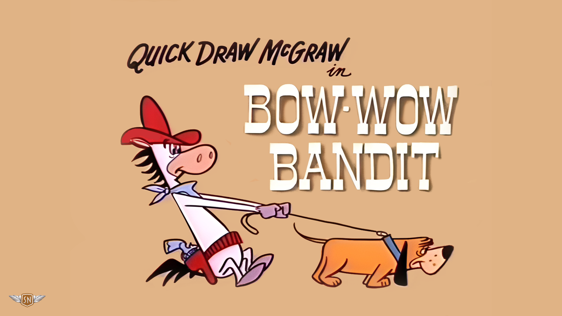
To illustrate how I build adaptive SVGs, I’ve selected an episode of The Quick Draw McGraw Show called “Bow Wow Bandit,” first broadcast in 1959.

Read the original at Articles on Smashing Magazine — For Web Designers And Developers