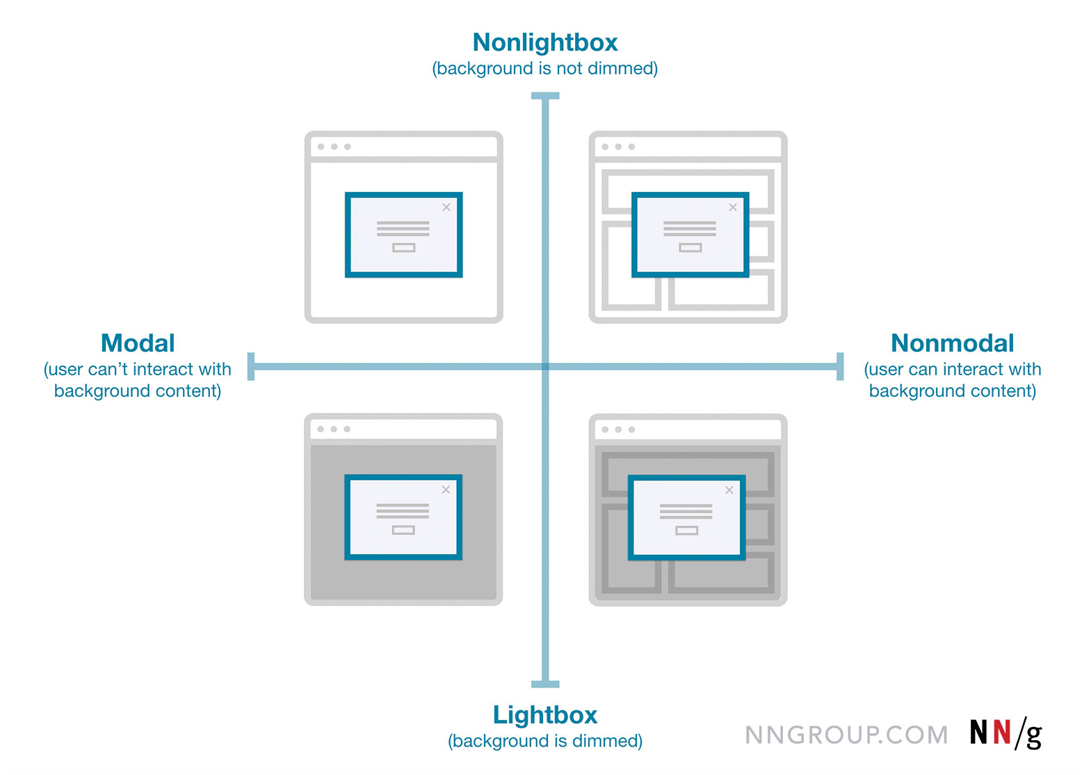
The choice between a modal and a full page is not a stylistic whim. It is a decision that directly shapes how people think, work, and make mistakes. And most teams get it wrong because they treat it as a branding exercise rather than a cognitive one.
A modal demands focus. It blocks the rest of the interface, strips away navigation, and forces a single decision. That is useful when the task is small, self-contained, and must be completed before anything else can happen. Think confirming a destructive action, entering a short form, or acknowledging a critical message. The modal works because it eliminates distraction. But it fails when the task requires reference. If a user needs to look up a customer ID, compare two rows of data, or jump between tabs to verify information, the modal becomes a trap. They lose context. They cannot scroll the background, open a second window, or check their notes without canceling the flow. Error frequency spikes, and task completion drops. The modal has interrupted them at the wrong moment.
A full page, by contrast, preserves the user's ability to navigate freely. It gives them back the browser's native tools: tabs, bookmarks, back buttons, and the ability to keep multiple views open side by side. That is essential for complex workflows, multi-step forms, or any task that demands cross-referencing. The tradeoff is that a full page removes the user from their original context. They lose sight of the parent screen entirely. That can be disorienting if the task is brief, but it is liberating if the task is deep.
The practical rule is simple. Use a modal when the action is atomic and the user needs no outside information. Use a full page when the action is compound and the user needs to consult external data. If you are unsure, err on the side of navigation. A page can be closed. A modal that blocks the wrong thing breeds frustration that lingers long after the dialog is dismissed. And never use a modal for anything that could reasonably be done later. That is how you turn a helpful tool into a hostile gate.