The confession in this piece lands close to home. Most of us have looked at CSS Container Queries and wondered, however briefly, whether they were just a more complex version of the media queries we already knew. The initial reaction, "Why exactly do I need this when media queries already exist?" is the exact question we hear from developers who are otherwise eager to adopt modern CSS. It is a fair question, and the answer is not about replacing one tool with another, but about understanding that they solve different problems. This distinction is worth exploring, especially when you consider how much effort we pour into building reusable components that are supposed to work anywhere. If you are looking for ways to make your front-end work harder, you might also be interested in how Unlock Dynamic Web Effects: Canvas UI Brings HTML to the Canvas pushes the boundaries of what we expect from web technologies, or how Beyond Similarity Scores: Deduplicating Data with Deterministic Stages shows that the real challenge is often in the logic, not the tool.
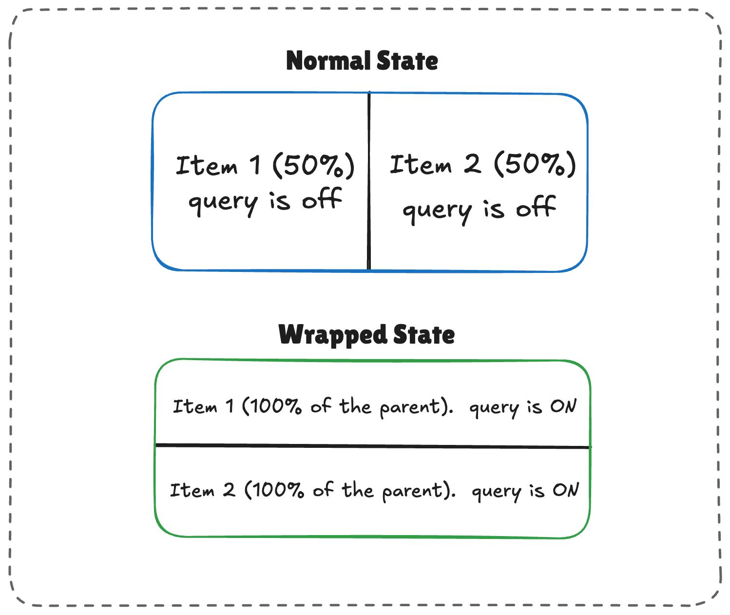
The core misunderstanding is thinking of container queries as a media query alternative. Media queries look at the viewport, the global canvas on which your entire page is drawn. They are the right choice when you are making decisions about the overall layout of a page, like switching from a multi-column layout on a wide screen to a single column on a phone. Container queries, on the other hand, look at the parent container. This is a profound shift because it means a component can be narrow and wide at different times, depending on where it is placed. A sidebar widget and a full-width hero section might use the same component, but a container query allows that component to adapt its own layout based on its available space, not the viewport. This is what makes it so powerful for building truly reusable design systems, where the component's behavior is a function of its context, not the page. We have all built a card component that looks perfect in a grid but falls apart when placed in a narrow aside; container queries are the direct answer to that pain.
For our readers, the practical takeaway is to stop treating container queries as a target for a specific breakpoint and start treating them as a property of the component itself. The question is not "at what screen width does this break?" but rather "when this component gets tight, what happens?" This is a more resilient way to build because it makes your UI immune to the unpredictability of where a component might be placed. The 94% browser support is a green light. The real work is in changing your mental model. The next time you reach for a media query to fix a component that looks cramped, ask yourself if you are reacting to the viewport or to the component's own space. If it is the latter, a container query is the more precise tool. The authors of the piece are right to be baffled by the low adoption, but the solution is not to tell people to use it more; it is to help them see the distinction clearly. That is the only way we will move past the legacy mindset that keeps us chained to the viewport. The open question is whether we, as a community, are willing to put in the effort to unlearn the old habits.