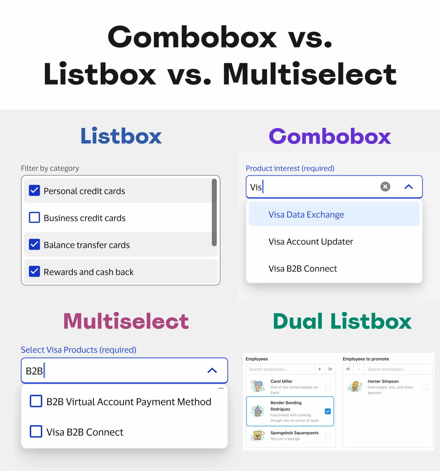
Choosing the right input pattern isn't a minor design detail, it's a decision that directly shapes how users experience your interface. Comboboxes, multi-selects, listboxes, and dual listboxes may look interchangeable at first glance, but each one answers a fundamentally different question about how people should interact with a set of options. The real differentiator is the number of available choices and how visible those choices need to be. That's the insight that separates a frustrating interaction from a fluid one.
When users face a small, fixed set of options, say, fewer than ten, a listbox or a set of radio buttons gives them immediate clarity. They see everything at once, make a choice, and move on. But as the list grows, visibility becomes a liability. A combobox shines here: it collapses the full list behind a single input, letting users type to filter while still offering a fallback for those who prefer to browse. The dual listbox, meanwhile, solves a specific problem for scenarios where users need to move items between two clearly defined groups, like assigning permissions or selecting team members. It's not a general-purpose component, and using it where a simpler multi-select would do only adds unnecessary cognitive load.
What this means for designers is straightforward: stop treating these patterns as stylistic preferences. Your users don't care about the visual flourish of a dropdown versus a list. They care about completing their task without second-guessing what the interface expects from them. If you pick a multi-select for a list of twenty items, you force users to scroll, squint, and risk misclicks. If you use a combobox for that same list, you let them type three letters and move on. The difference is not subtle, it's the difference between a tool that respects their time and one that wastes it.
The practical takeaway here is a simple rule: match the pattern to the scale of the choice. For fewer than ten items, show them all. For more than ten, let users filter. For tasks that involve reallocation, use a dual listbox. And never assume that because two patterns look similar, they serve the same purpose. Design smarter UI by making the input pattern invisible, so the user's attention stays on the work, not the widget.