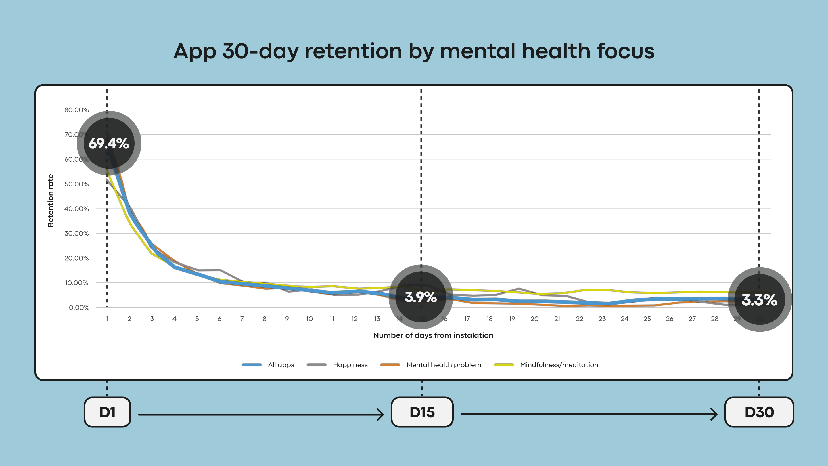
The relentless drive for visual novelty in user interface (UI) design often overlooks a crucial truth: not all trends are universally beneficial. Kat Homan’s recent piece, “Designing For Distressed Users: Why Mental Health Apps Shouldn’t Follow Every UI Fashion,” brilliantly highlights this, particularly within the sensitive context of mental health applications. The alarming churn rates—nearly 95% of users abandoning an app by day 30—underscore the need for a more considered approach. It’s a stark reminder that aesthetics and perceived innovation shouldn’t overshadow core usability and therapeutic goals. This resonates deeply with our perspective on enterprise AI, as explored in [One interface isn't enough for enterprise AI], where we've observed that forcing a single, trendy interface across diverse workflows can equally diminish utility and adoption. The mental health space, with its inherently vulnerable users, demands an even higher level of scrutiny regarding design choices.
Homan’s evaluation framework – a welcome addition to the design toolkit – offers a practical way to assess whether visual flourishes and interaction patterns genuinely support user well-being or inadvertently create barriers. The core argument—prioritizing refuge, trust, and reduced cognitive load over fleeting trends—is fundamentally sound. This isn't about advocating for a bland or uninspired aesthetic; rather, it’s about consciously aligning design choices with the specific needs of the user. Consider, too, the larger conversation around AI-driven interactions. As we see with advancements in AI agents, as detailed in [Loop Engineering for AI Agents: How /loop is Changing AI Workflows], the ability to create persistent, adaptive systems requires a deep understanding of user behavior and a commitment to ongoing refinement. Mental health apps, in their own way, are also seeking to create persistent support systems, and interface design plays a vital role in fostering that sense of continuity and trust. The temptation to mimic the shiny, attention-grabbing interfaces of social media platforms or other consumer applications is understandable, but ultimately detrimental in this context.
The consequences of neglecting this principle are far-reaching. A cluttered, confusing, or overly stimulating interface can exacerbate anxiety and distress, effectively undermining the app's purpose. The research cited—demonstrating a median 30-day retention of only 3.3%—is a damning indictment of the status quo. It speaks to a systemic failure to prioritize user experience in a domain where emotional well-being is paramount. The rise of personalized AI, and the increasing sophistication of conversational interfaces, as exemplified by [Character.AI enters the microdrama arena with its own productions, but there’s a twist], presents both opportunities and challenges. While these advancements can enhance engagement and provide tailored support, they also necessitate a heightened awareness of the potential for cognitive overload and manipulation—risks that are amplified in the mental health space. Designers must adopt a more responsible and empathetic approach, grounding their decisions in clinical best practices and user research.
Ultimately, Homan’s article serves as a crucial reminder that good design is not about chasing trends; it’s about solving problems and serving human needs. As AI continues to permeate our lives, and as mental health apps become increasingly integrated into our daily routines, the imperative to prioritize usability and well-being will only grow stronger. The question moving forward isn't simply *can* we build more visually engaging interfaces, but *should* we, particularly when the stakes are so high? And perhaps more importantly, how can we measure the true impact of design choices on user outcomes, beyond mere engagement metrics and retention rates?