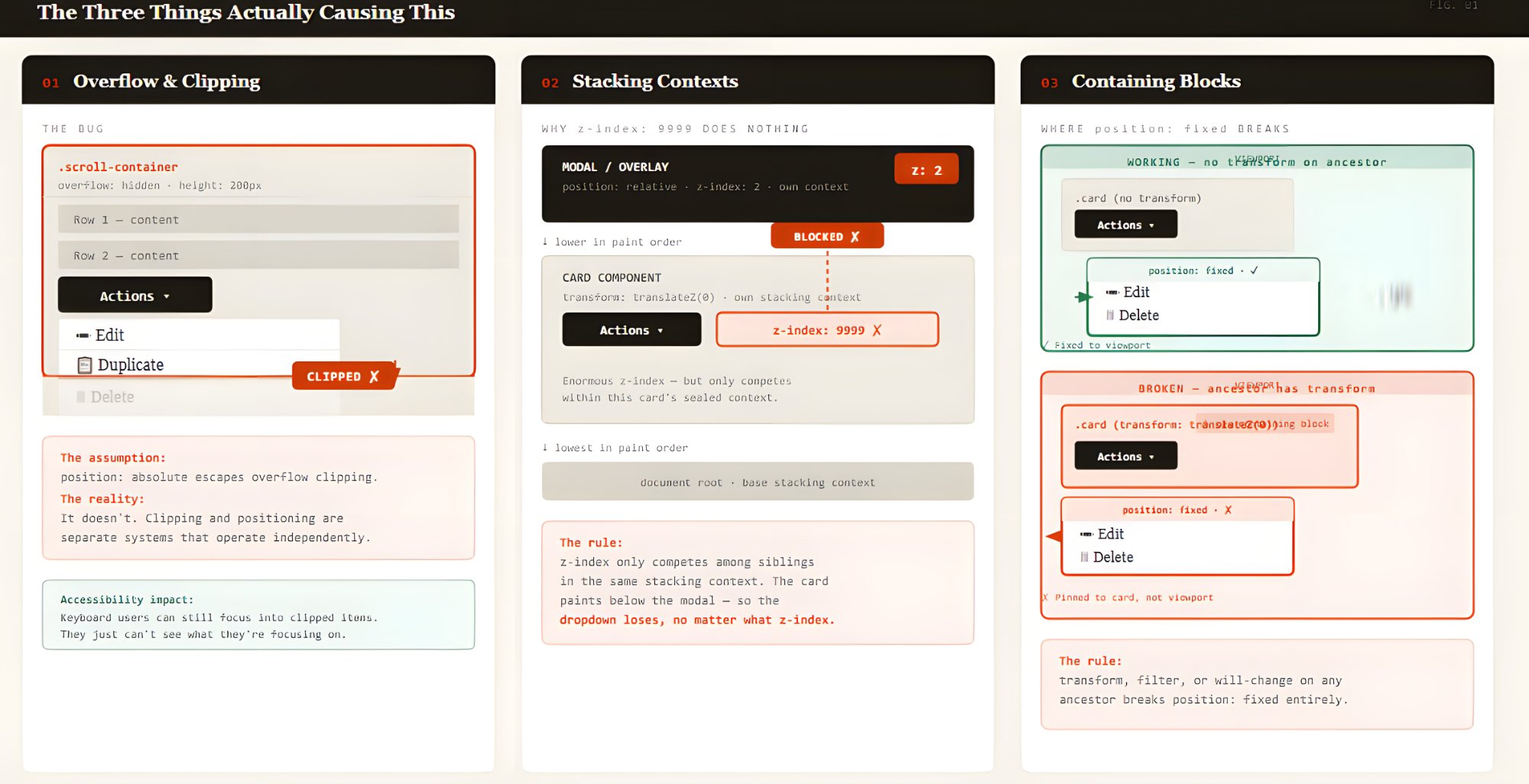
Dropdowns clipped inside scrollable panels are one of those bugs that feels personal. It doesn't matter how clean your code is or how many frameworks you rotate through, the problem follows you. Godstime Aburu's diagnosis of this issue is exactly right: the container, the stack, and the framework change, but the bug stays the same. That tells us something important. This isn't a framework problem. It's a fundamental tension between how browsers handle overflow and how we expect UI elements to behave.
For anyone building data-heavy interfaces, this is the kind of friction that quietly erodes trust in a product. A user clicks an action menu, half the options vanish behind a scrollable edge, and they're left wondering whether the feature is broken or they missed something. That doubt compounds with every clipped dropdown. The practical cost is real: more support tickets, slower workflows, and a persistent feeling that the tool is fighting you instead of helping you. Aburu's explanation makes it clear that the root cause, CSS overflow combined with stacking contexts, is mechanical, not mysterious. That's good news. It means the fix is knowable and repeatable.
What stands out most is that the solution isn't treated as a secret. It walks through why the clipping happens and offers concrete approaches, from adjusting `position` and `z-index` to using portal patterns that render dropdowns outside the clipping container. These aren't hacks. They are deliberate architectural choices that respect how browsers actually render layers. That is the kind of practical knowledge that separates a frustrating codebase from a reliable one. It's also the kind of knowledge that should be standard in any team building spreadsheet-like interfaces, where scrollable panels and action menus are the norm, not the exception.
So here is the concrete takeaway: if your dropdowns are getting clipped, stop treating it as a one-off styling fix. Treat it as a signal that your component architecture needs to account for overflow boundaries at the design level. Aburu's article gives you the map. Use it to build interfaces where the user never has to wonder if the menu is hiding from them. That is the difference between a tool that works in isolation and one that works in the real world.