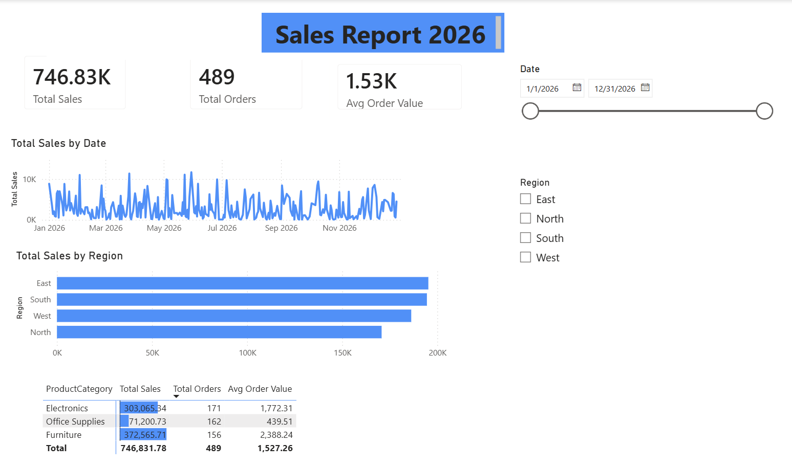
Creating an interactive dashboard with Power BI is a significant step for anyone looking to elevate their data management capabilities. The tutorial titled "Power BI Tutorial: Create Your First Dashboard" serves as a comprehensive guide for users eager to transform raw data into informative visual reports. By the end of the tutorial, users will not only have a polished report but also the skill to publish it to the cloud, configure refresh schedules, and set alerts for real-time data updates. This hands-on approach empowers users to engage with their data actively, making it a valuable resource for both beginners and seasoned professionals.
The importance of this tutorial extends beyond just learning how to use Power BI; it reflects a broader trend in data management where accessibility and interactivity are paramount. Traditional spreadsheet tools often require extensive manual effort to generate insights, which can be time-consuming and prone to error. In contrast, the capabilities of Power BI allow for dynamic data exploration, enabling users to query information and visualize it in ways that enhance understanding. For those who may be accustomed to more static reporting methods, this tutorial could mark the beginning of a transformative journey towards more agile data practices. For additional insights into advanced visualization techniques, you might consider exploring our Power BI Dashboard Tutorial | Create Sales Dashboard in Power BI | Advanced Visualization.
Moreover, the tutorial highlights the power of cloud technology in modern data management. By deploying reports to the cloud, users can ensure that their insights are not only accessible but also actionable from anywhere. This flexibility is increasingly crucial in a world where remote work is becoming the norm. The ability to set alerts and configure refresh schedules helps maintain the relevance of the data being analyzed, ensuring that decision-makers have the most current information at their fingertips. This aspect of data management resonates well with our audience, who are often looking for innovative solutions to enhance productivity and streamline workflows.
As we look to the future, the evolution of tools like Power BI represents a shift in how organizations perceive and interact with their data. No longer are users confined to outdated methods that hinder their ability to make timely, informed decisions. Instead, we are witnessing a movement toward more intuitive, user-friendly technologies that democratize data access. The insights gained from these dashboards can drive strategic initiatives, foster collaboration, and ultimately lead to better business outcomes. It raises an intriguing question: how will the continued advancement of AI and machine learning further transform the landscape of data visualization and reporting? As we embrace these changes, staying abreast of developments in data management will be essential for anyone looking to leverage their data effectively.
In conclusion, utilizing Power BI to create an interactive dashboard not only enhances individual productivity but also signals a shift toward a more data-driven culture in organizations. The ability to turn raw data into actionable insights is a critical skill in today's digital age. As users engage with these tools, they will discover the power of data to inform their strategies and drive innovation. The journey to mastering such technologies is ongoing, and as we continue to explore these avenues, the possibilities for transformation are boundless.