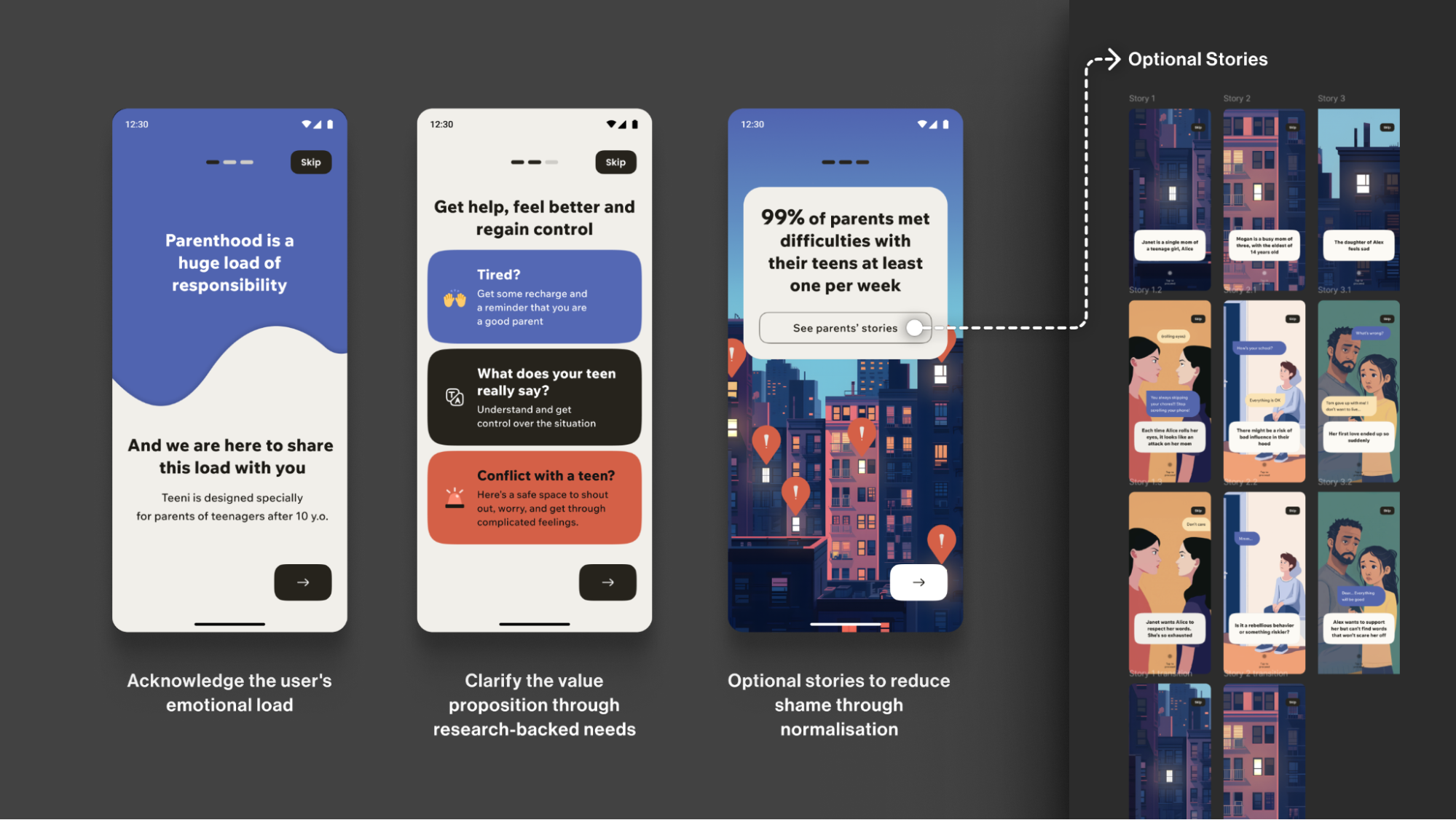
Empathy isn't a feature to toggle on in a settings menu. In mental health design, it is the foundation every decision must stand on. When a user opens an app while struggling with anxiety, the interface should feel like a steady hand, not a flashing billboard. Clashing colors, a shaming notification about a broken streak, and a paywall blocking the very tool the user came for give a vivid example of what happens when that principle is ignored. That isn't just frustrating, it's a breach of trust at a moment of vulnerability. We believe that any mental health product that prioritizes engagement metrics over user safety has already failed its core mission.
This means designers must stop treating empathy as a layer of polish applied late in the process. It belongs in the wireframe stage, in the choice of colors, in the tone of every notification, and in the structure of every paywall. A streak reminder might work for a language-learning app; for someone managing depression, it can feel like a public shaming. The practical takeaway is that mental health apps need a framework built on consent and predictability. Users should never be surprised by a demand for payment when they are seeking relief, and they should never be punished for inconsistency in a space where inconsistency is part of the condition. Trust is built one interaction at a time, and it can be lost in a single poorly timed alert.
The opportunity here is not merely to avoid harm but to design systems that actively communicate safety. That means offering clear, upfront choices about how data is used, letting users set their own rhythms instead of enforcing a rigid schedule, and ensuring that every visual element, from font size to color contrast, reduces cognitive load rather than adding to it. When an app treats a user's emotional state as the primary design constraint, it transforms from a tool into a companion. This is not about aesthetics or retention curves. It is about respecting that the person on the other side of the screen may be reaching out for help, not for a loyalty badge.
Here is what that looks like in practice: a mental health app should allow a user to skip a session without explanation, should never lock essential coping tools behind a paywall, and should present itself with the calm clarity of a quiet room. The design choices that make a product feel "sticky" in a commercial sense can be actively harmful in a therapeutic one. If you are building in this space, start with the question of what a user needs in their worst moment, not their best one. Build for that moment first, and everything else will follow.