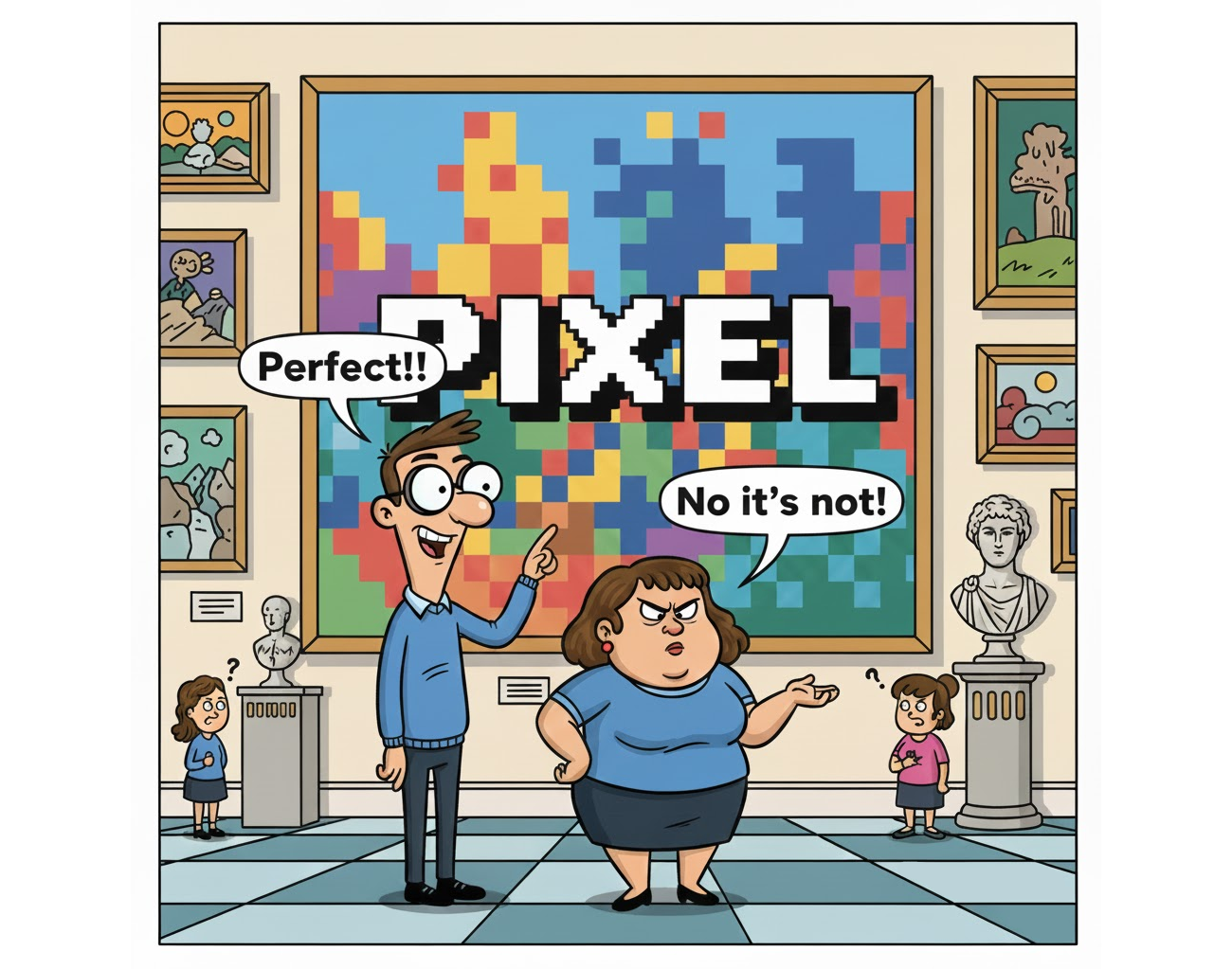
The "Pixel Perfect" mindset has outlived its usefulness, and clinging to it is holding designers back from building for the web as it actually exists. Amit Sheen makes the case that the pursuit of exact pixel alignment was born from the static, predictable world of print, and it simply does not translate to a fluid, multi-device environment where screen sizes, resolutions, and user contexts shift constantly. For anyone still chasing that level of control, the message is clear: you are fighting the medium instead of working with it.
What this means in practical terms is a redefinition of what "perfection" looks like. In a fluid web, perfection is not about making every element land on an exact coordinate. It is about creating systems that adapt gracefully. Sheen points to the reality of 2026, where AI-enhanced workflows and advanced tooling have changed how we design and build. These tools should free us to think in terms of flexible layouts, responsive components, and user-centered outcomes, not in obsessing over a static mockup that will never match the final experience. The cost of pixel perfection is rigidity. The payoff for letting go is a design that actually works for the person holding the device.
There is a practical shift here for teams. If you are still measuring success by how closely a live site matches a design file, you are measuring the wrong thing. The real metric is whether the interface adapts, whether the content is readable, and whether the user can accomplish their goal regardless of the screen. Sheen's argument is not an excuse for sloppy work. It is an invitation to invest that energy into building resilient systems instead of fragile artifacts. The tools we have now can handle the heavy lifting of adaptation, but only if we stop demanding that they replicate a fixed, pixel-perfect original.
The concrete takeaway is this: stop treating the design file as the source of truth and start treating the user's experience as the only thing that matters. If your process still begins with a fixed-width canvas and ends with a QA pass that checks for pixel alignment against that canvas, you are building for a web that no longer exists. The future belongs to designers who embrace the fluidity of the medium, not those who try to freeze it.