data visualization tools
144 stories filed under data visualization tools on Beyond Market Intelligence. The newest of them: “Your spreadsheets are stuck in the 1980s. Let's explore what comes next.”, “Navigating independent research one clear step at a time”, and “From Data Science Student to Data Professional: Finding Your Next Step”. Hi everyone, I’m a CSIE student in Taiwan, and I’ve been exploring a pressing issue: why are we still using 1980s logic to tackle 2026 data challenges? Submitting a research paper as an independent researcher can be a fascinating journey, filled with both challenges and discoveries. Acme AI is the next-generation, AI-powered spreadsheet platform built to replace Excel and redefine how analysts, data scientists, and enterprise teams work… The list below is every data visualization tools story on Beyond Market Intelligence, newest first.
Your spreadsheets are stuck in the 1980s. Let's explore what comes next.
Hi everyone, I’m a CSIE student in Taiwan, and I’ve been exploring a pressing issue: why are we still using 1980s logic to tackle 2026 data challenges? Despite our powerful technology, many of us are trapped in outdated practices, wrestling with manual tasks and complex formulas. I’m developing the Dxtreame Organizer to change this narrative, focusing on intuitive data organization and enhanced security.
Navigating independent research one clear step at a time
Submitting a research paper as an independent researcher can be a fascinating journey, filled with both challenges and discoveries. My experience with submitting my first preprint to arXiv revealed a process that, while complex, was straightforward at each step once I understood what was required. In this guide, I’ll share key steps and insights that can empower other independent researchers to navigate their own submission processes effectively, ensuring that they are well-prepared and confident in their contributions to the field.
From Data Science Student to Data Professional: Finding Your Next Step
Navigating the expansive field of data science can be daunting, especially as you approach the midpoint of your degree. With a solid foundation in Python, SQL, and core statistical concepts, you’re well on your way. However, knowing what to focus on next is key to enhancing your skills and career prospects. Should you dive deeper into theoretical concepts, explore new tools, or perhaps tackle advanced machine learning techniques? Seeking guidance from the community can illuminate your path forward and empower your learning journey.
Your PDF exports are corrupting your data. Discover a smarter export path.
Are you frustrated with Adobe Acrobat’s PDF to Excel conversions? Many users encounter issues where numbers like 75-01-04 turn into unintended dates, thanks to Acrobat’s automatic formatting. This problem originates before the file even opens in Excel, leading to potential data corruption. Fortunately, there are effective alternatives. You can export as CSV for raw strings, utilize Power Query to set column types, or explore AI-based extraction tools for accurate text retrieval. Discover these solutions and reclaim control over your data management process.
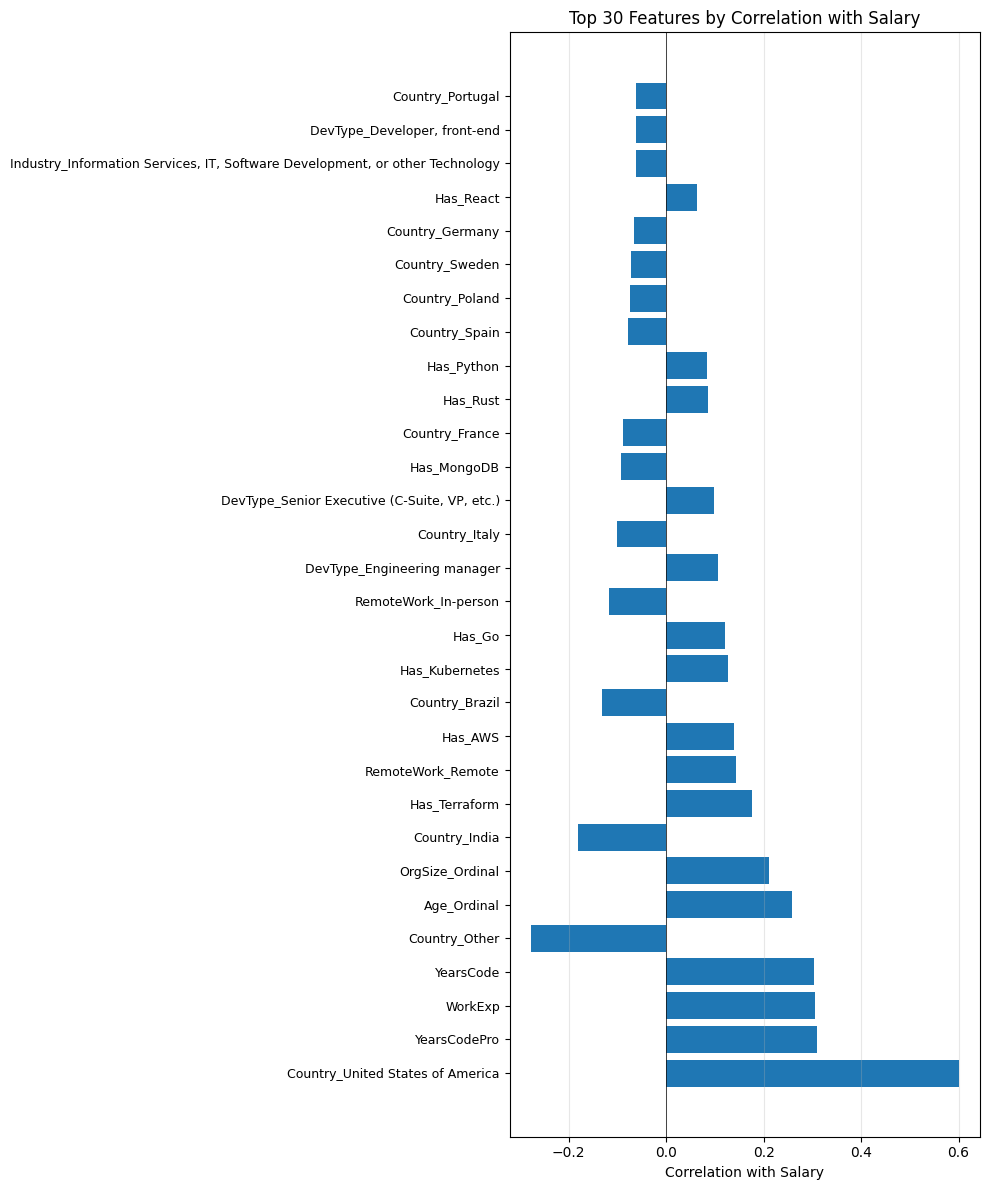
From Messy Survey Data to a Predictive Salary Model in Two Steps
In Part 2 of our tutorial series on predicting tech salaries with machine learning, we build upon the clean, fully numeric dataset created from the 2023 Stack Overflow Developer Survey. With 75 features and nearly 15,000 rows, we are well-equipped to dive into model development. This segment will guide you through selecting the right algorithms, evaluating performance, and refining predictions. Join us as we transform data insights into actionable salary forecasts, empowering you to navigate the evolving tech landscape with confidence.
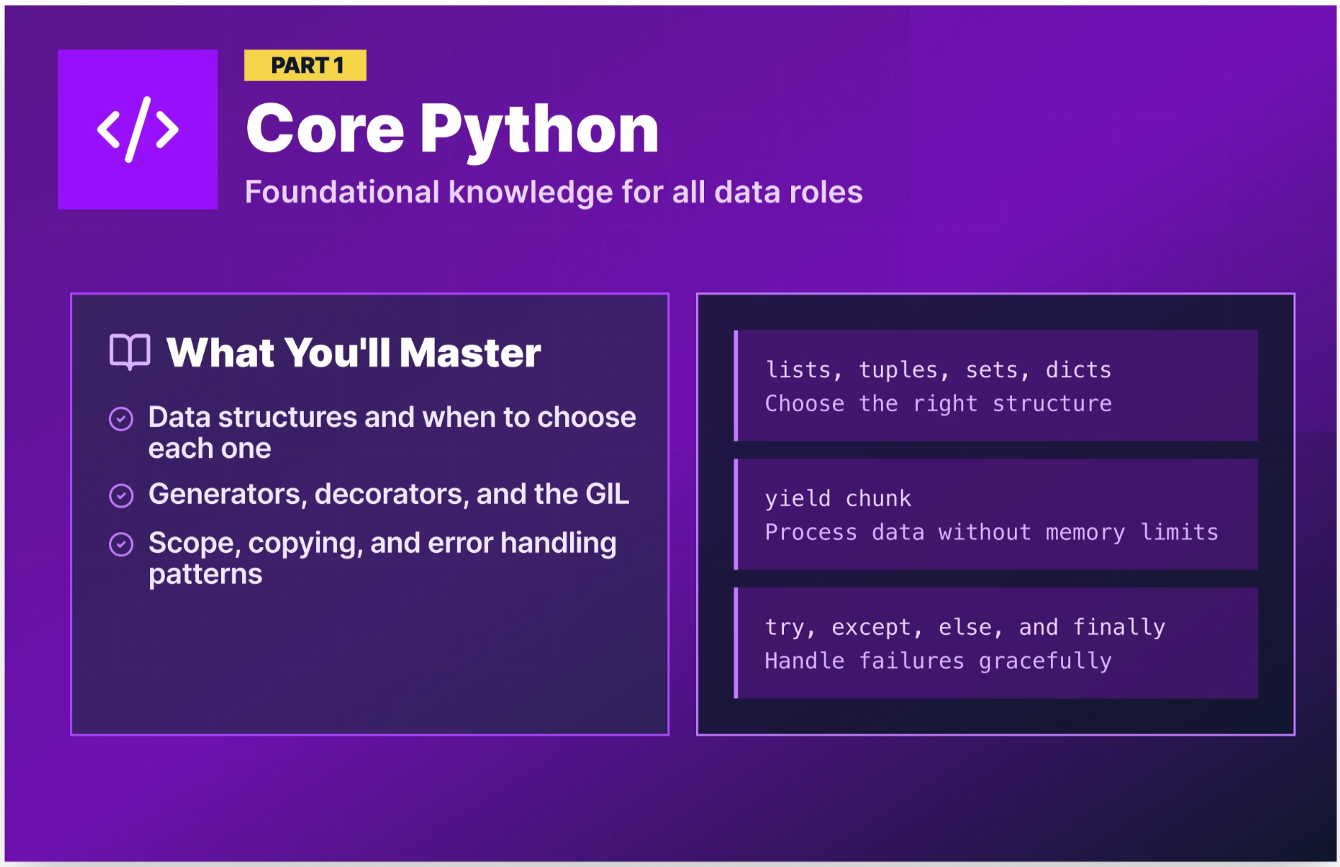
Ace Your Data Role Interview with Python Questions That Test Real Skills
Prepare to elevate your data role interviews with our comprehensive guide featuring over 40 Python interview questions and answers tailored specifically for data positions. Each question comes complete with a practical code example, a clear explanation of the underlying concept, and insights into what interviewers are truly assessing. Organized by role, this resource helps you concentrate your study efforts where they will be most impactful. With Python's prominence in data science and analytics, mastering these questions will empower you to showcase your skills confidently.

Make font scaling testing a natural part of your design flow
Testing font scaling for accessibility with Figma variables seamlessly integrates into everyday design workflows, making accessibility a natural part of the creative process. The objective is not to overhaul existing practices but to enhance them through simple, effective work processes that align with a team’s routine. By incorporating font size testing into the design flow, Figma empowers designers to prioritize accessibility effortlessly. This approach transforms accessibility from an optional consideration into an essential, inherent aspect of design, fostering a more inclusive environment for all users.

DeerFlow 2.0: A powerful AI agent harness for enterprise exploration
DeerFlow 2.0, launched by ByteDance, is a groundbreaking open-source AI agent orchestrator designed to streamline complex, long-duration tasks in enterprise settings. This powerful framework enables the autonomous orchestration of multiple AI sub-agents, facilitating deep research, report generation, and data analysis—all within a secure, isolated environment. Available under the MIT License, it allows for seamless local deployment, ensuring data sovereignty and compliance. As it gains traction in the AI community, enterprises must weigh its technical demands against the potential for transformative productivity enhancements.
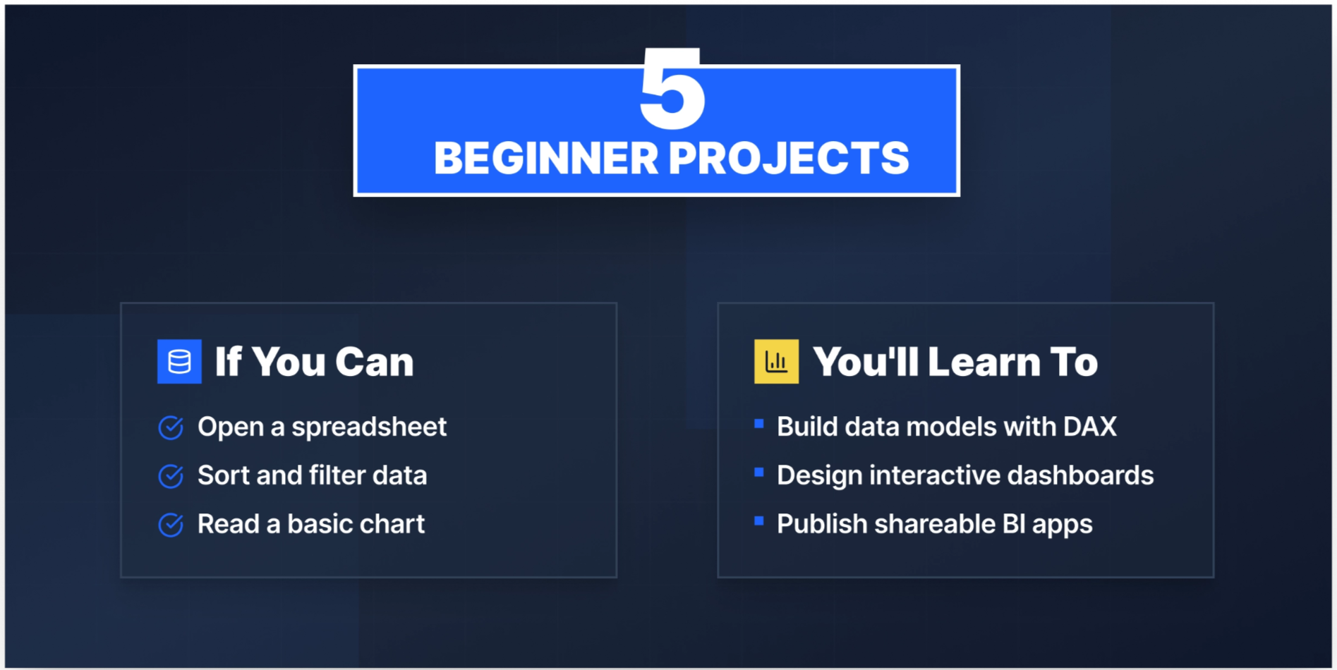
Transform Your Data Portfolio with These 15 Power BI Project Ideas
Building a robust Power BI portfolio is essential for aspiring business or data analysts in 2026. Employers seek candidates who can transform messy data into clean models and create impactful dashboards that drive informed decision-making. 15 compelling Power BI project ideas will not only showcase your technical prowess but also demonstrate your ability to derive actionable insights from data. These projects serve as tangible evidence of your skills, empowering you to stand out in a competitive job market.

Dropdowns Clipped Inside Scrollable Panels? Here's How to Fix It
Dropdown menus are essential for streamlined user interactions, yet they can encounter issues when placed inside scrollable containers. Often, these dropdowns become clipped, causing critical options to disappear behind the panel's edge. In this insightful piece, Godstime Aburu delves into the reasons behind this problem and provides practical, actionable solutions to ensure dropdowns function seamlessly within scrollable environments. By understanding the mechanics at play, you can enhance user experience and maintain the accessibility of your interface. Discover how to resolve these challenges effectively.
Why repetitive data work still holds your productivity back
I'm researching how professionals automate repetitive Excel and CSV workflows in their daily tasks. I'm in the process of developing a desktop tool designed to visually streamline these processes, but I want to gain insights into the challenges users face today. If you have experience with automating these workflows, I would greatly appreciate your feedback. Please share your most recent automation project, its frequency, and the specific frustrations you encountered, as well as the tools you currently use. Thank you for your valuable input!
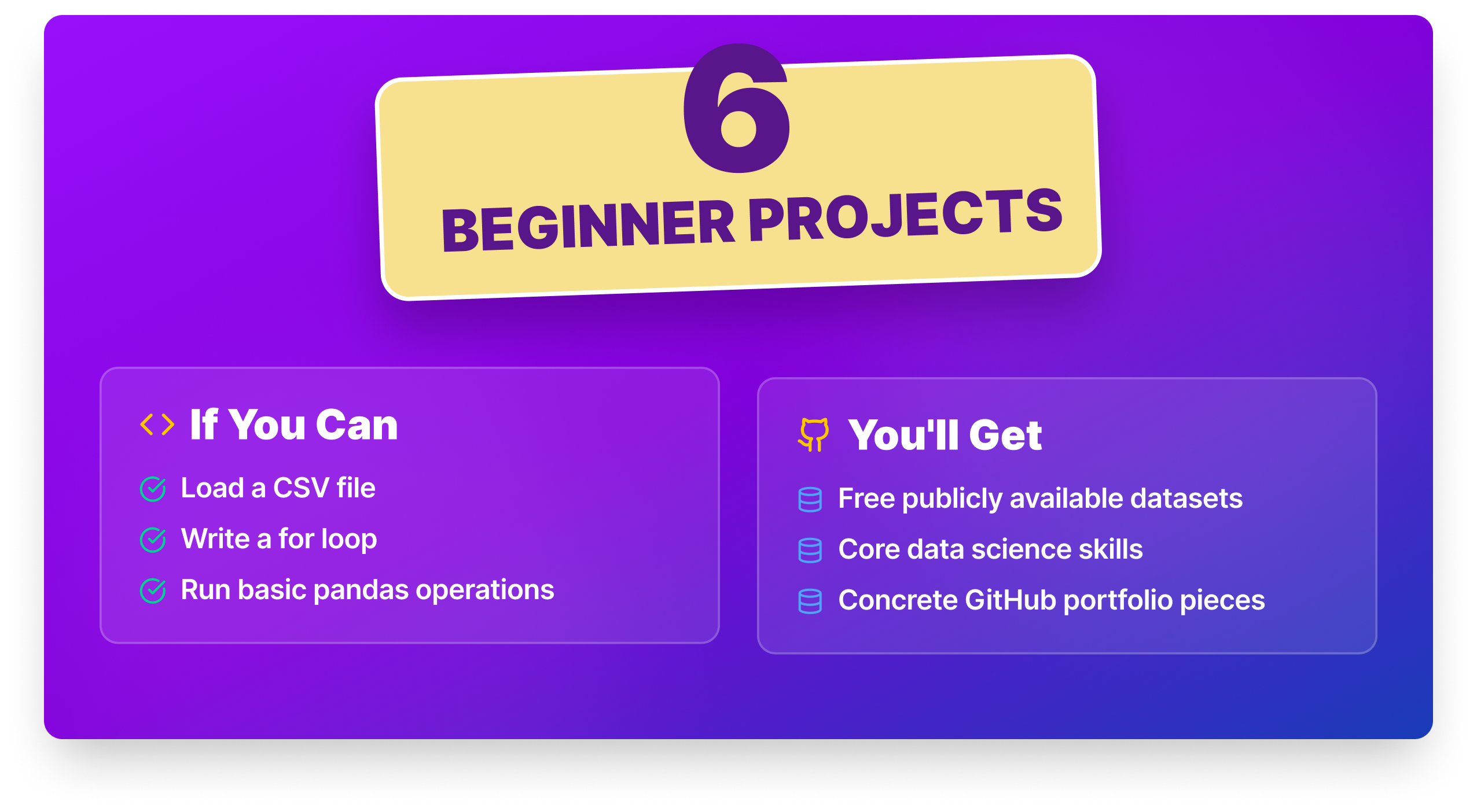
30 real data projects to build a portfolio that speaks for itself
Building a strong data science portfolio is essential for showcasing your skills and standing out to potential employers. "30 Data Science Projects for Beginners to Advanced" provides an invaluable resource, offering a curated list of projects that span various skill levels. Each project includes source code, real datasets, and step-by-step instructions to guide you through completion.

Find a coding platform that adapts to your pace and your goals
In a world overflowing with coding platforms, finding the right fit for your learning style, goals, and budget can be a daunting task. While many platforms promise to teach you how to code, the true challenge lies in discovering one that aligns with your unique needs from the outset. This curated list of 24 Codecademy alternatives for 2026 empowers you to explore diverse options, ensuring you invest your time wisely in building essential skills rather than starting anew.
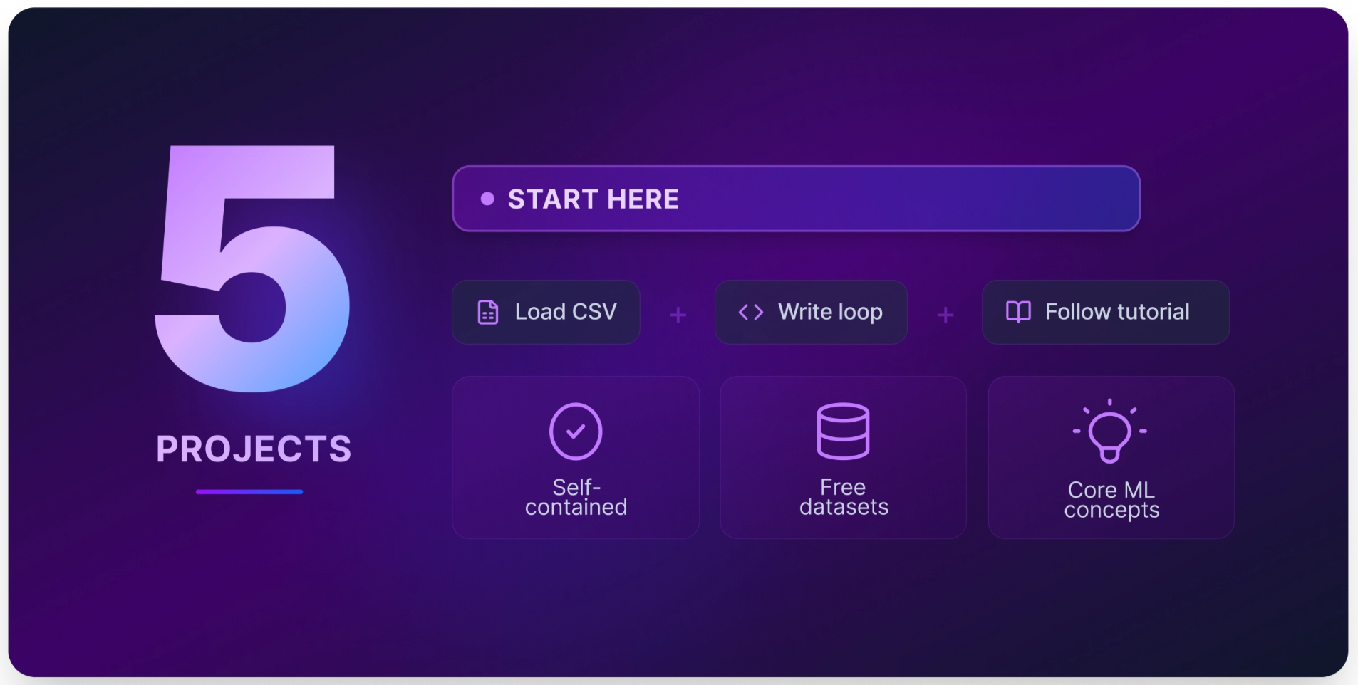
Build real ML skills with 14 curated projects and ready-to-use datasets
Embarking on a journey into machine learning can be both exciting and overwhelming. 14 carefully curated projects, organized by difficulty, cater to everyone from beginners to advanced practitioners. Each project includes free datasets, starter code, time estimates, and valuable insights on how to enhance your work into a standout portfolio piece. By exploring these projects, you'll not only develop transferable skills but also create tangible results to impress hiring managers, empowering your career in this dynamic field.
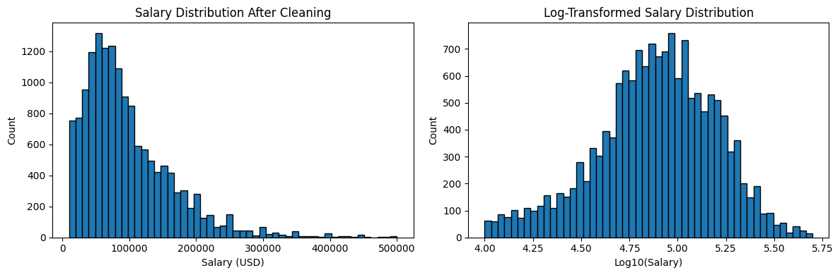
Turn Your Tech Salary Questions into Data You Can Act On
In this tutorial, we embark on an exciting journey to predict tech salaries using machine learning, leveraging insights from the 2023 Stack Overflow Developer Survey. Have you ever questioned whether learning Rust is a worthwhile investment or if remote work truly offers higher pay? These intriguing inquiries are more than just speculation. With the appropriate dataset and machine learning tools, we can transform these questions into actionable insights. Join us as we explore how to harness data to uncover valuable trends in the tech industry.
Explore smarter workflows from this week's top Excel community insights.
Welcome to this week’s recap of the /r/Excel community, highlighting the top discussions and insights from February 28 to March 6, 2026. This week featured a mix of solved queries, such as calculating BMI percentiles, alongside ongoing challenges like automating Excel screenshots to WhatsApp groups. Users engaged deeply with topics, reflecting the community's commitment to collaborative problem-solving. Dive into the top posts and comments to discover innovative solutions and practical tips that can enhance your spreadsheet skills and productivity.
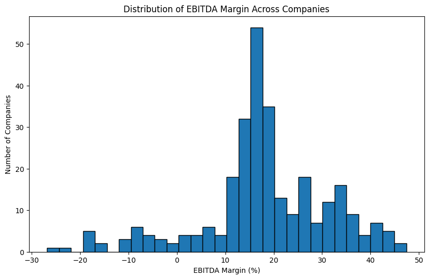
From Spreadsheets to Code: Explore Financial Data with Nasdaq's API
In the world of financial analysis, accessing data has often required cumbersome downloads or costly subscriptions. However, the advent of APIs has transformed this landscape. With just a few lines of Python code, you can effortlessly pull structured financial datasets from providers like Nasdaq, enabling you to begin your analysis in minutes. In this tutorial, we will guide you through the process of connecting to the Nasdaq Data Link API, empowering you to explore and leverage rich financial data with ease and efficiency.
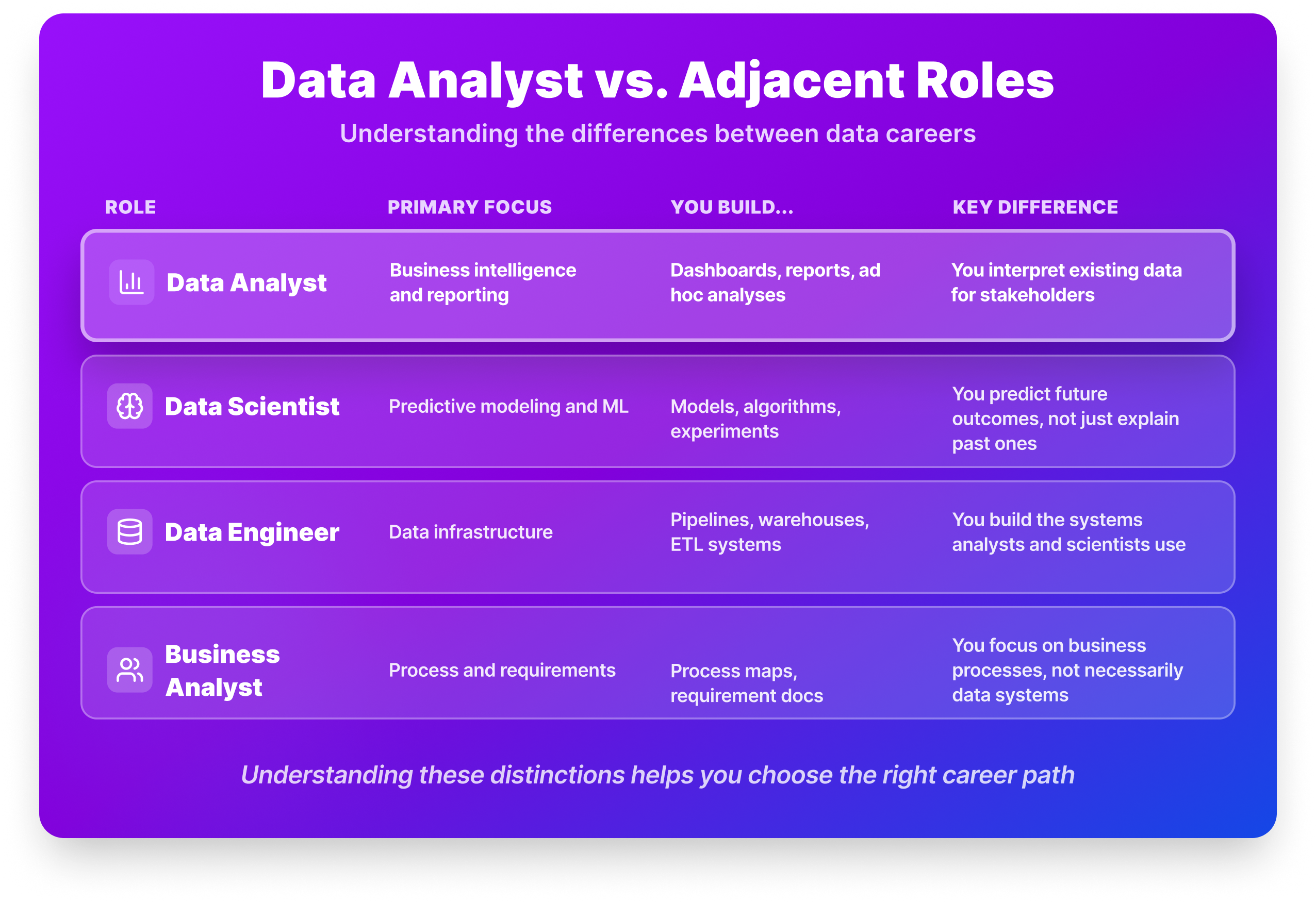
From Raw Numbers to Real Decisions: Your Path to Data Analysis
Navigating the path to becoming a data analyst can feel overwhelming, especially with advice ranging from mastering Excel to pursuing a master’s degree. The reality is more nuanced. Data analysts are crucial in transforming raw data into actionable insights, answering pivotal questions like why sales fluctuate or how customer behavior changes. This step-by-step guide for 2026 will clarify the essential skills, educational requirements, and practical experiences you need to thrive in this dynamic field.
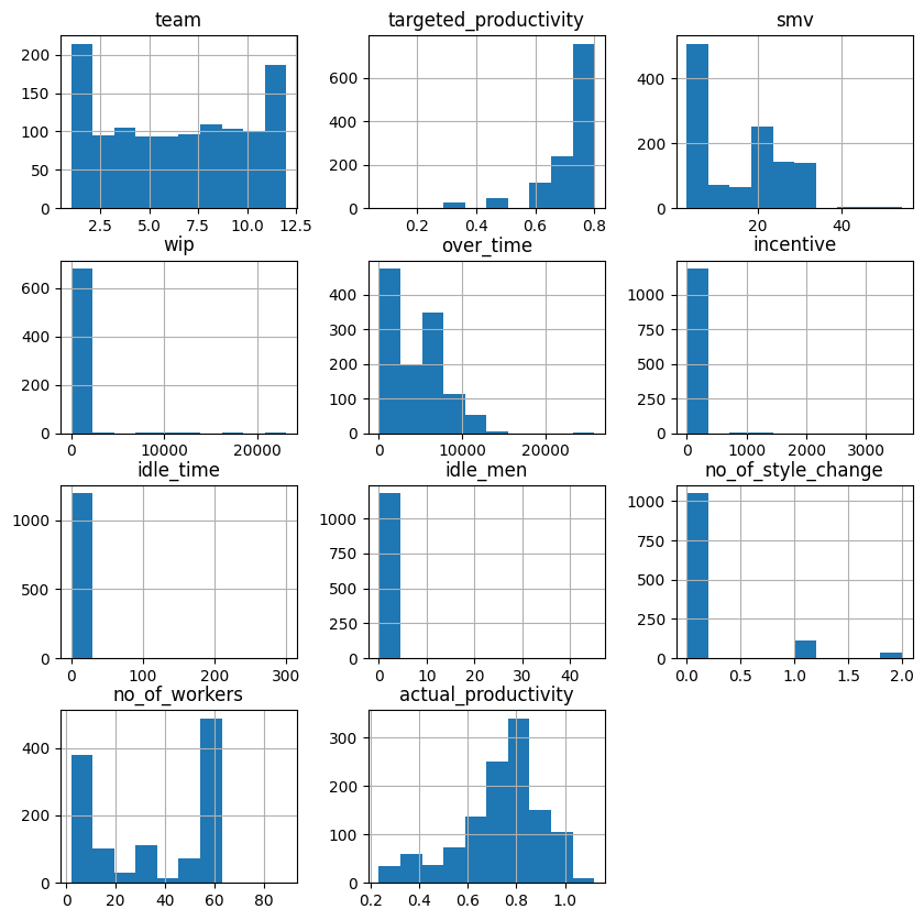
Empower Factory Teams by Predicting Daily Productivity with AI
Are you grappling with the challenge of predicting employee productivity in your factory? In this project tutorial, we’ll guide you through using decision trees and random forests to create a machine learning model that forecasts whether a workday will be productive. By analyzing team-level productivity data, you’ll uncover the key conditions that drive performance on the factory floor. Join us as we transform complex data into actionable insights that empower you to optimize productivity and enhance team outcomes. Let’s dive in!

Start with the tools that actually matter for entry-level analysts
Navigating the world of data analysis tools can feel overwhelming, especially with countless lists suggesting 15, 20, or even more options. For entry-level analysts, this plethora of choices often complicates rather than clarifies where to begin. In this guide, we’ll distill the essentials, highlighting the top 10 data analysis tools that empower you to tackle real-world challenges effectively. Discover how these tools can streamline your workflow and enhance your insights, setting you on a path to success in your data analysis career.
Discover how a free add-in transforms Excel dashboards with powerful new visuals.
Are you frustrated with the limitations of traditional Excel dashboards? Introducing Pine BI Lite, a free Excel add-in that enhances your reporting capabilities with 12 powerful visualizations, including a dynamic vertical waterfall chart. This intuitive tool simplifies Actual vs Target reporting and variance analysis, allowing you to create impactful dashboards directly from the ribbon. With built-in templates and easy customization, Pine BI Lite transforms your data into actionable insights. Dive in to discover how this innovation can elevate your Excel experience!

Design Smarter by Reducing the Digital Footprint of Every Pixel
In a world where every high-resolution image and complex animation comes with a hidden cost, the need for sustainable UX has never been more pressing. Designers are now challenged to rethink their approach, prioritizing responsibility over excess. As we look ahead to 2026, the hallmark of sophisticated design will be its ability to minimize impact while maximizing user experience. This guide will explore eco-friendly interface strategies that not only enhance performance but also align with the values of a more sustainable future.
Earn Trust in Your AI Skills With a Machine Learning Certification
In 2026, the landscape of machine learning certifications is more complex than ever, with countless options vying for your attention. Whether you’re transitioning into tech, expanding your developer toolkit, or seeking to elevate your existing data skills, choosing the right certification is crucial for proving your expertise. This guide will navigate through the best machine learning certifications available, highlighting what sets them apart and how they align with industry demands.
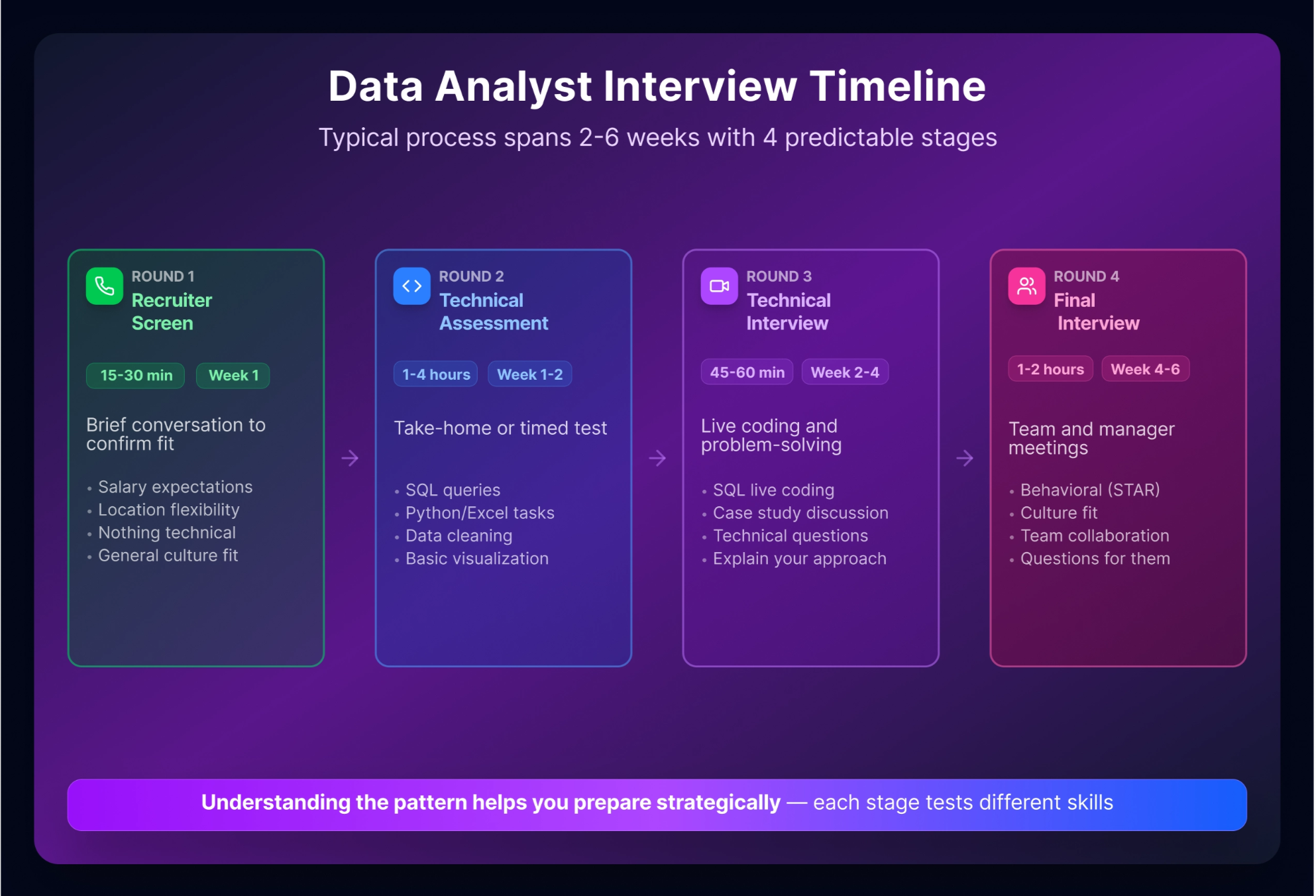
From SQL anxiety to interview confidence with 40 actionable questions
Preparing for a Data Analyst interview can be daunting, especially when self-doubt creeps in: "Am I ready? What if I freeze?" This guide alleviates those concerns by providing over 40 essential interview questions and answers tailored for entry-level candidates. With a strong foundation in SQL, Python, and statistics, you can confidently navigate the interview landscape. Dive in to discover the insights and strategies that will empower you to showcase your skills and secure that coveted position in 2026. Let’s transform your anxiety into assurance.